1971 O-pee-chee Guy La Fleur #148
1 / 2
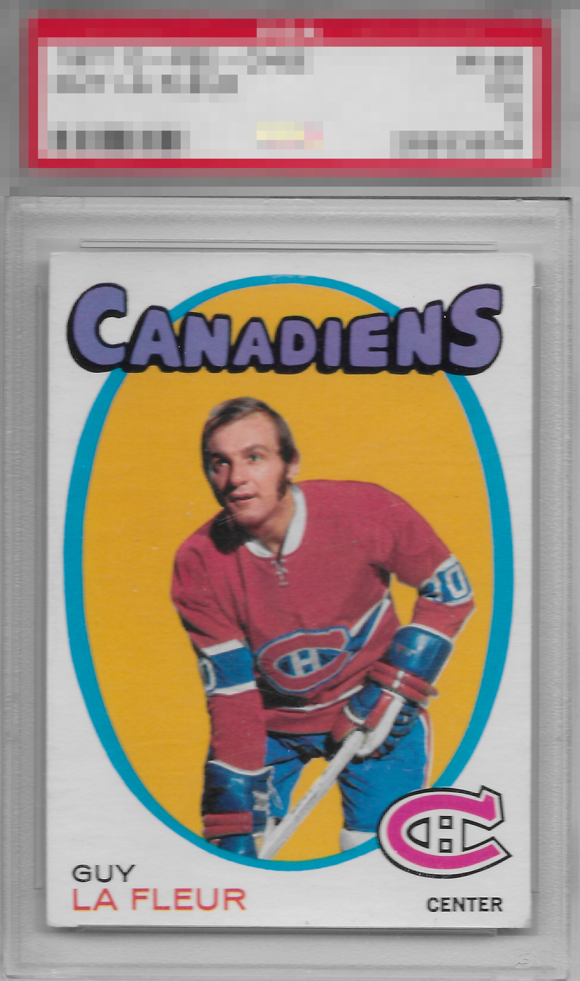
Click to enlarge
💬
Reviews & Discussions
12 total reviews


Side centering and lower right corner make impact but the overall eye appeal remains rather high to me.

The corners havw some wear and there's some surface damage, but overall the image is good.

Solid example with good centering. The big distraction for me is the bottom right corner which stands out.

card looks really nice with strong colors and image but the image looks out of focus and there appears to be surface wear just below chin and also on his right side of his shirt luckily it blends in well enough

Locked
5 reviews
EyeQ+
121.0
Global Population
1
POPULATION ACROSS ALL GRADES AND GRADING COMPANIES
Global Eye Rank
#1
Population in Grade
1
POPULATION IN THIS GRADE ACROSS ALL GRADING COMPANIES
Eye Rank in Grade
#1
EYEQ+ TROPHY CASE

1st Place
GLOBAL

1st Place
IN-GRADE
📊
Rating Distribution
12 total reviews
G
0%
A+
1 rating
14%
1
A
1 rating
14%
1
A-
2 ratings
29%
2
B+
3 ratings
43%
3
B
0%
B-
0%
C+
0%
C
0%
C-
0%
D+
0%
D
0%
D-
0%
F
0%
Centering is close enough where I don't fixate on the shift, and so that leaves one corner.