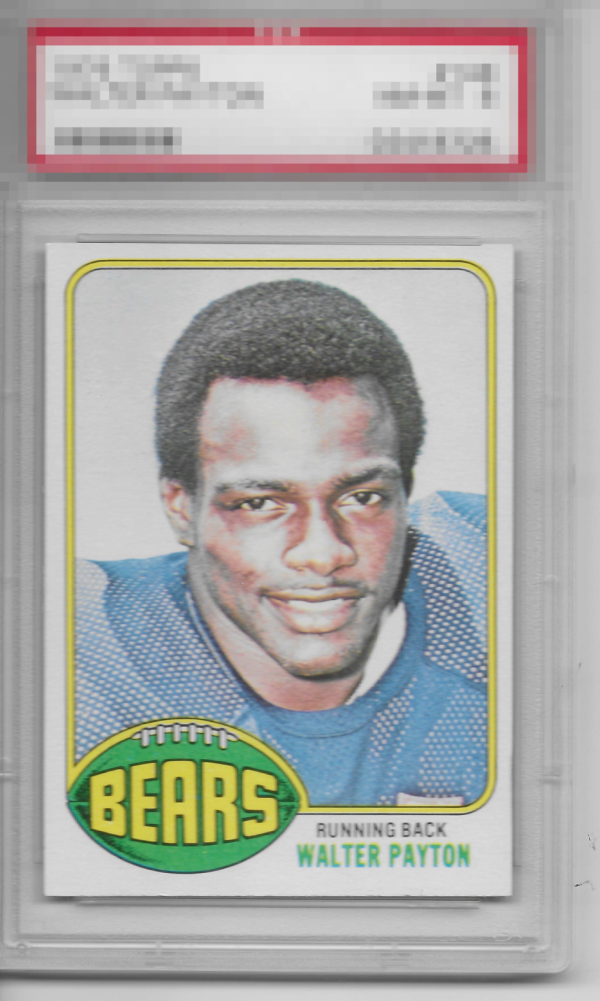
1976 Topps Walter Payton #148
1 / 2

💬
Reviews & Discussions
8 total reviews


Nice example. I find the tilt keeping this example from getting a higher grade. Corners look good as well.


slight centering shift and borders sizes are not balanced but because of the way the card is layed out it is not that dramatic. The card is nice and clean and I enjoy it

Sharp example of Sweetness, with centering and tilt the one aspect that impacts eye appeal. Clings to the top tier for me.
7 reviews
1 review
EyeQ+
--
Global Population
6
POPULATION ACROSS ALL GRADES AND GRADING COMPANIES
Global Eye Rank
—
No Eye Q+ score
Population in Grade
2
POPULATION IN THIS GRADE ACROSS ALL GRADING COMPANIES
Eye Rank in Grade
—
No Eye Q+ score
EYEQ+ TROPHY CASE

GLOBAL

IN-GRADE
Trophies appear here when earned.
📊
Rating Distribution
8 total reviews
G
0%
A+
0%
A
0%
A-
5 ratings
71%
5
B+
0%
B
1 rating
14%
1
B-
1 rating
14%
1
C+
0%
C
0%
C-
0%
D+
0%
D
0%
D-
0%
F
0%
Centering is all I would flag as otherwise this Sweetness is even higher in the eye appeal department.