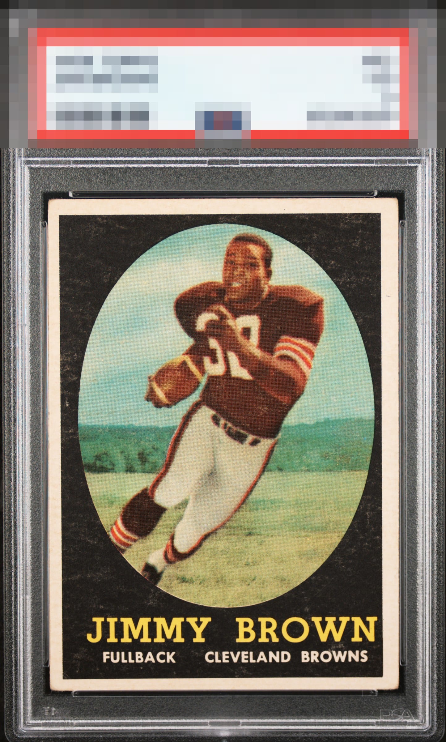
1958 Topps Jim Brown #62
Reviews & Discussions
12 total reviews

This has much better focus than most and the black is also cleaner than many examples I have seen. Centering, tilt, and some corner wear add up to some impact on eye appeal which is very strong.

Surface and corner wear, along with okay centering. The image is in good shape, though.

Some surface wear in the background. Centering shift to the bottom left. Card has really good color.

Very good overall eye appeal, as centering is not too off and the corners don't draw my attention. The salient flaw is the usual surface snow in the black.

Nice card with good eye appeal. Love the big bold borders but there is a L/R shift. The colors and image are good but the snow holds it back

Minor tilt with bright white borders. Obvious corner wear. Card presents well but does show a lot of snow in the black which is distracting along with other print issues with the jersey. Tough card to find with good eye-appeal and this one just misses the A tier.
EyeQ+
EYEQ+ TROPHY CASE


Rating Distribution
12 total reviews
Background “snow” continue to plague many of the JB rookies