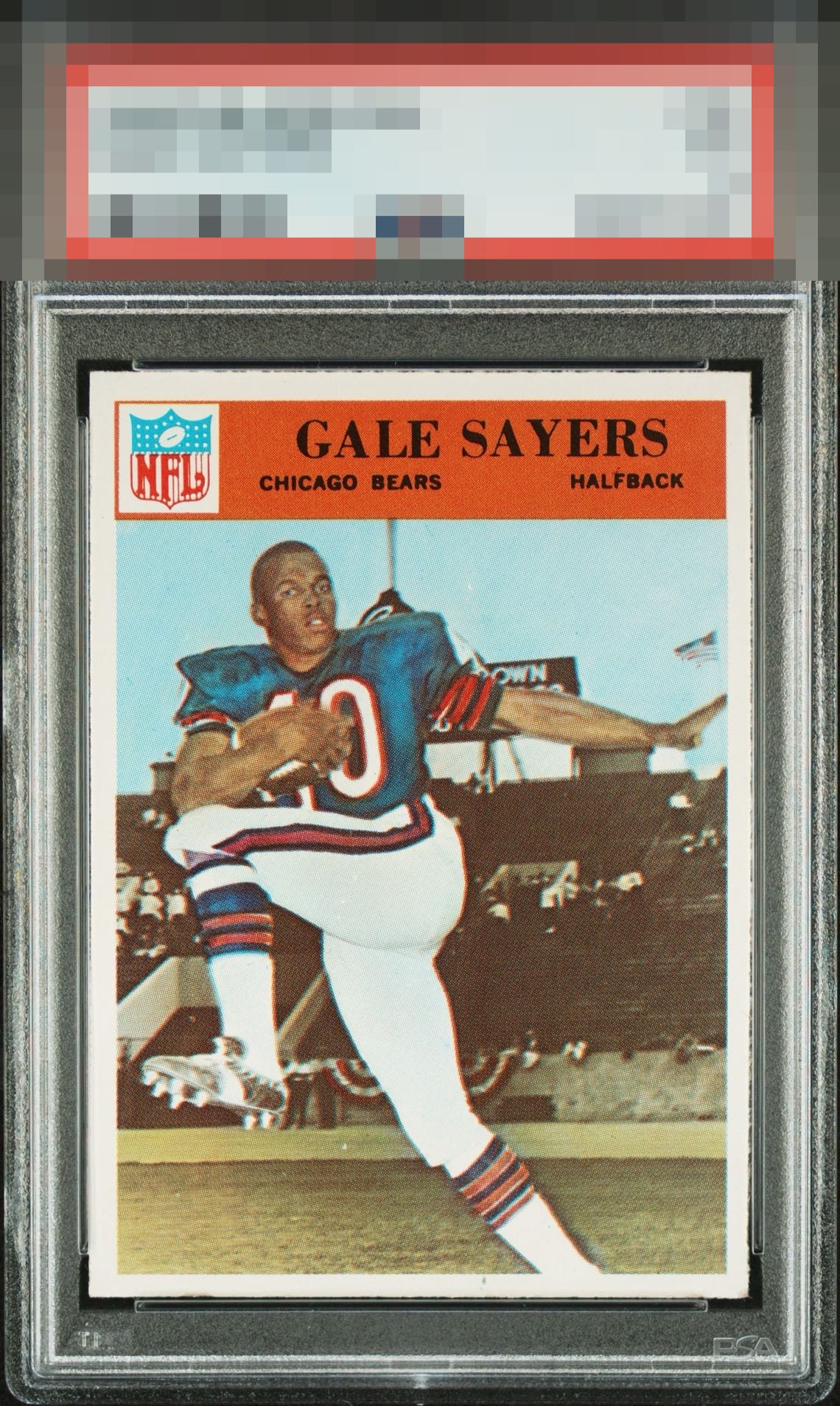
1966 Philadelphia Gale Sayers #38
1 / 2

💬
Reviews & Discussions
8 total reviews

Great looking card. Slight centering shift / tilt noticeable at the bottom, but no other flaws that bother me.


A Stunner of a Card and really love how the borders frame the card and overcome the slight centering opportunity. Gale Sayers jumps off the page Wow


This is dangerously close to GT eye appeal for me. So pretty. Whatever might be up technically, I just don't care!

Wow, my kind of card right here. I see this in the wild at a show, I snap it up and thank the Cardboard Gods for that gentle corner wear that maybe allowed me to scoop up another card :) The centering is great, just a hair low. The image is clean and focused. This just hits my eye so well, knew it at first glance. No loud flaws.
7 reviews
1 review
EyeQ+
--
Global Population
2
POPULATION ACROSS ALL GRADES AND GRADING COMPANIES
Global Eye Rank
—
No Eye Q+ score
Population in Grade
2
POPULATION IN THIS GRADE ACROSS ALL GRADING COMPANIES
Eye Rank in Grade
—
No Eye Q+ score
EYEQ+ TROPHY CASE

GLOBAL

IN-GRADE
Trophies appear here when earned.
📊
Rating Distribution
8 total reviews
G
0%
A+
6 ratings
86%
6
A
0%
A-
1 rating
14%
1
B+
0%
B
0%
B-
0%
C+
0%
C
0%
C-
0%
D+
0%
D
0%
D-
0%
F
0%
Card pops on first glance. Great color and bright borders really hits the eye just right. Only drawback is the centering is off just a touch. Congrats to the owner of this standout.