1986 Fleer Michael Jordan #57
Reviews & Discussions
12 total reviews

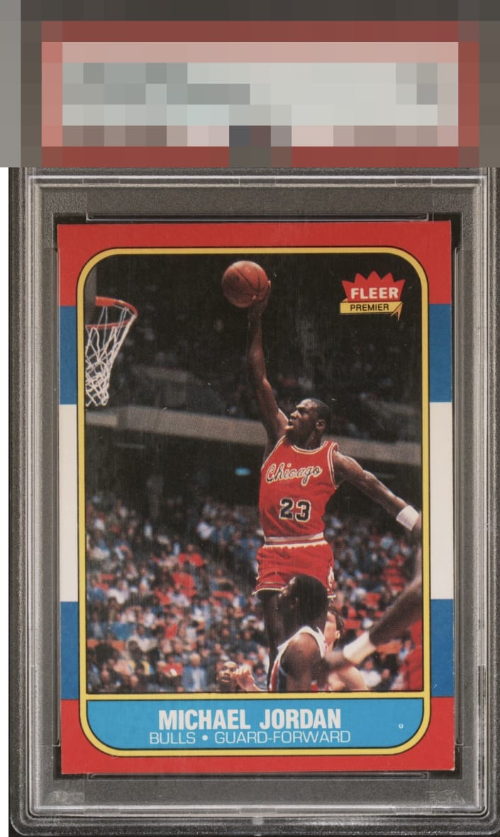
Centering is off just enough to overpower my eye. Fish-eye also commands attention. Card Just misses A tier for my eye.

Solid good B eye appeal right here. Centering, one corner, and for me that print dot actually makes the most impact on the eye appeal. Edges are fantastic and great to have on this card in that condition.

Off-centered to the bottom left. Fisheye in the blue. Edges and corners look good except for the bottom right. Colors and image look nice.

Card presents well as a mid tier card. There is that white circle we often call fish eye in the blue, the centering is off and minor surface wear. The colors and image are good but do not POP as others do

Edges are the strength here, while centering and the print dot make the most impact on eye appeal. The lower right corner touch matters least to me in terms of centering, print dot, and corner. Overall lands middle tier.

I'm seeing solid second-level eye appeal here as the edges and three corners are very intact, while lower right, centering, and a fish eye in the blue are the dampening factors.
EyeQ+
EYEQ+ TROPHY CASE


Rating Distribution
12 total reviews
Great card but centering, some surface wear, and that fish eye in the blue keep this at a B level.