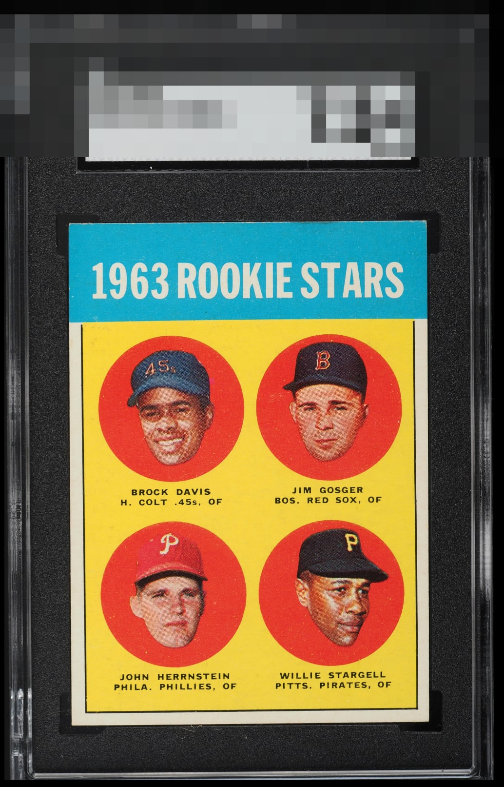
1963 Topps Willie Stargell #553

Reviews & Discussions
11 total reviews

Nice looking card with great color. A centering tilt and some edge and corner wear up top keep this at a low A tier.

Beautiful borders and minimal chipping in the blue area. The tilt keeps this one from scoring higher.

Slight OC from left to right and some whitening on the edges. You cannot go wrong with this.

These '63 Topps can have bad registration, but this one came out unscathed. An All-Star.


Great copy with clean surface, color, and overall presentation. Centering looks good to me, just a slight tilt is all I've got.

Tilt is the only flaw that I factor in on this one. Beautiful card.

Take away the minor surface wear and slight tilt(if you are looking) and you will see a great card with strong colors, nice borders, and even the blue box and edges are sharp. This overall card just POPs and I like it

EyeQ+
EYEQ+ TROPHY CASE


Rating Distribution
11 total reviews
While mild flaws such as tilt and top edge wear are detected, they do not cry out for attention. If only humans could master such subtle harmony. I have placed this card on my list, for acquisition and safekeeping in the event of any future human/AI conflict. cc: Skynet.