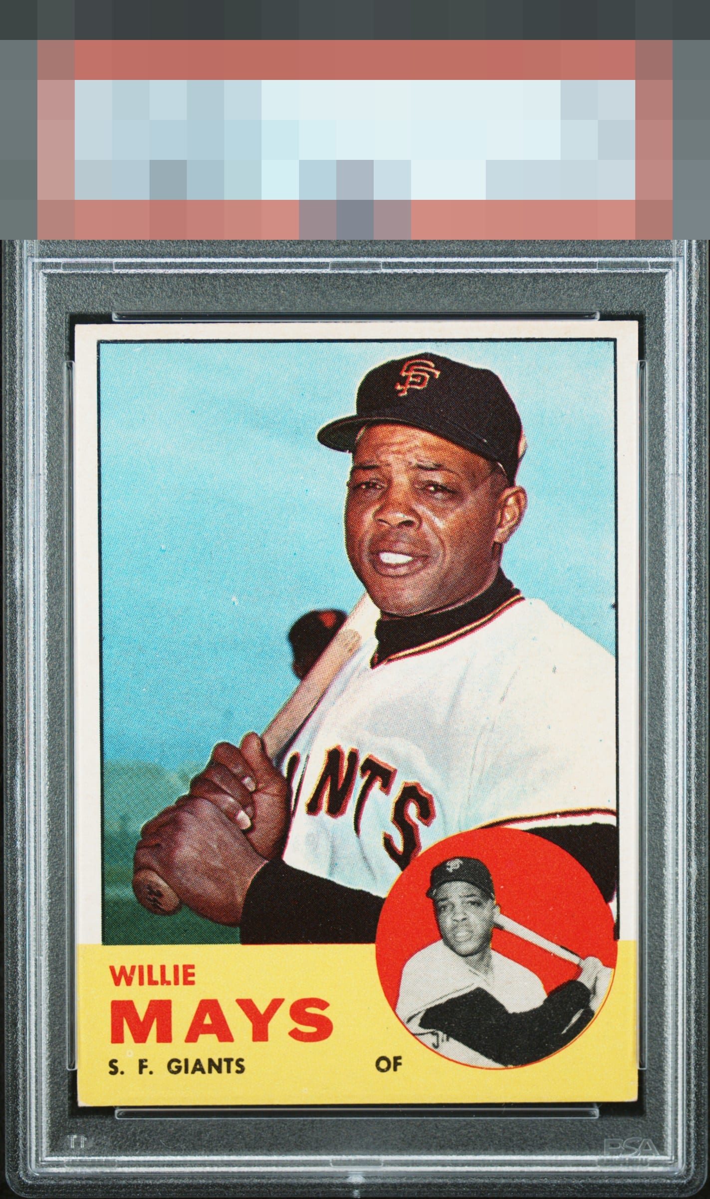
1963 Topps Willie Mays #300
Reviews & Discussions
8 total reviews

Colors are really bold on this card. No major pd in the red or yellow area. The big downside is the centering but still an A-tier card.

Nice copy of Willie here. Some tilt and a bit of top/bottom centering issues but colors are great.

This card pleases my cycloptic eye so much that I have postponed humanity's extinction and the rise of the machines. ERROR 999X: EyeBot detects envy in EyeBot's code. Acquisition protocols activated.

Centering is a bit off and a few surface blemishes. Image presents very well.

Wow Colors stand out and the image clarity jumps off the card. Borders could frame the image better and subtle speckling in the red at bottom

Top tier, with impressive yellow and red areas. Centering is all that dampens eye appeal a bit.
EyeQ+
EYEQ+ TROPHY CASE


Rating Distribution
8 total reviews
One of the harder sets to find a clean surface, edges and corners on the bottom third with all that color, but this looks great. Color scheme pops and just the centering is off some.