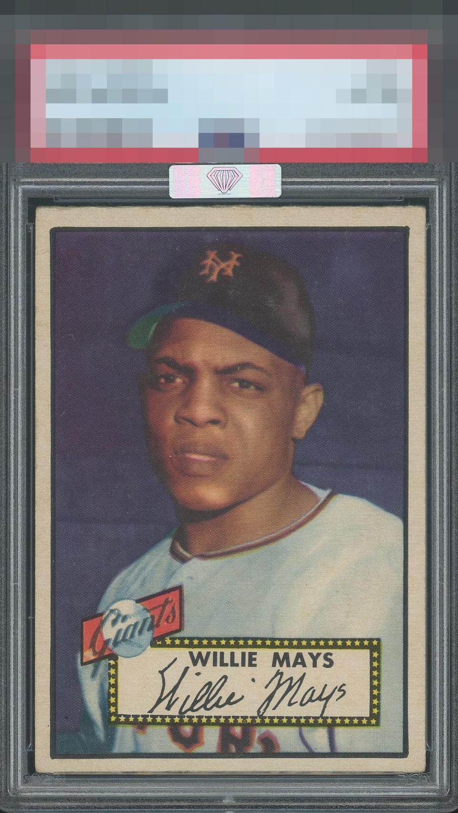
1952 Topps Willie Mays #261
1 / 2
Click to enlarge
💬
Reviews & Discussions
8 total reviews

Nice all around "Say Hey". Centering top to bottom is noticeable but still presents well. Obvious corner wear that does not overtake the eye-appeal of this card.

I agree with Mr Baker here. Don’t need a sticker to tell me this is a high eye appeal card though. The scan looks a bit light - if the color is bold in hand, I’d bump this to an A+. Beauty.

Centering is the one issue to my eye. The rest is very enjoyable.

nice looking card with solid image and colors. wish the borders were a little brighter and the borders are nice sized but not even and not centered as good as it could be


6 of 7 reviews
2 reviews
EyeQ+
--
Global Population
40
POPULATION ACROSS ALL GRADES AND GRADING COMPANIES
Global Eye Rank
—
No Eye Q+ score
Population in Grade
14
POPULATION IN THIS GRADE ACROSS ALL GRADING COMPANIES
Eye Rank in Grade
—
No Eye Q+ score
EYEQ+ TROPHY CASE

GLOBAL

IN-GRADE
Trophies appear here when earned.
📊
Rating Distribution
8 total reviews
G
0%
A+
0%
A
1 rating
17%
1
A-
4 ratings
67%
4
B+
1 rating
17%
1
B
0%
B-
0%
C+
0%
C
0%
C-
0%
D+
0%
D
0%
D-
0%
F
0%
Centering shift and print dots near his face is noted, colors may be a little faint but this is a grail of a card with very nice eye appeal.