1952 Topps Willie Mays #261

Reviews & Discussions
11 total reviews

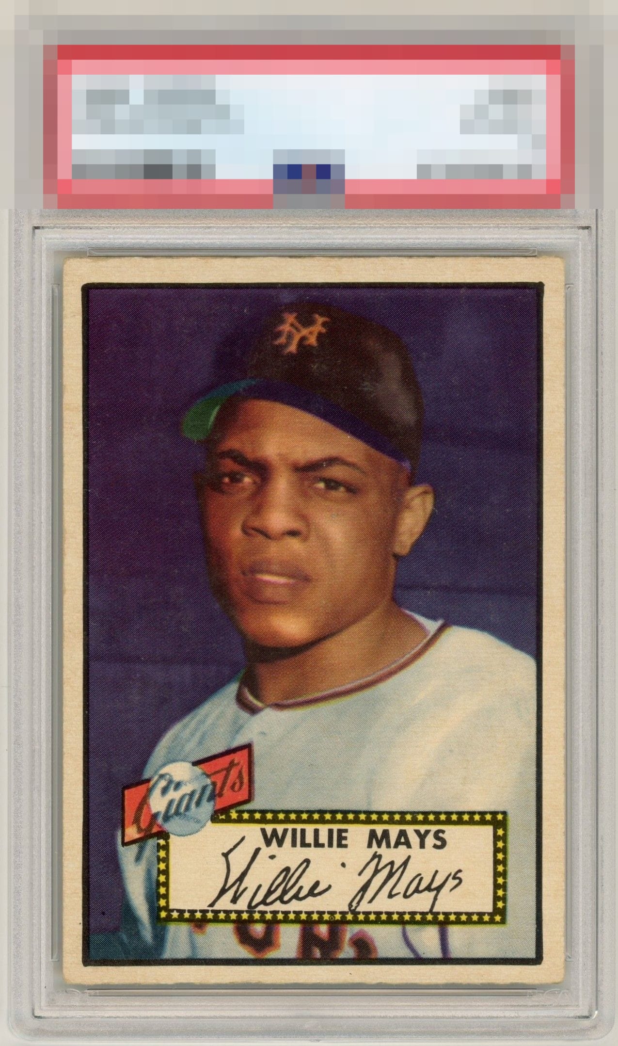
Strong eye appeal. Centering is so close to landing this overall in the top tier.

Above-average centering for a ’52T, paired with a great image and color combination, puts this one in the A tier for me.

The edging of this card are hard to ignore but the surface and image of this card blows it away. Centering is stellar with some softer corners.

Great looking card with centering while not right down the strike zone is it is still a strike. The 4 corners show even wear which keeps the eye from being focused on that part of the card. Congrats to the owner of this stellar example.

This is a gorgeous 52 Topps Mays. Color and registration are on point. Centering is a bit top heavy, but not to the point of hurting the viewing experience. The only weakness would be the corners, but I don't care that much when the rest of the card is so good to look at.

Great card. Nicely framed with just lightly touched corners. Nice color - everything you like to see on this card.

Great looking card. Minor surface wear but it blends in well and does not hurt its eye appeal as a result. THe centering is nice and nice size borders. Strong colors and image. This is Sweet

Relatively well-centered. Nice color and image. A few surface issues around the cap area hold it back a bit.

Very much a standout among 52T Mays examples, this specimen has great centering that is about as good as it gets, with no surface issues whatsoever that nag my eye. Really beautiful example of a classic.
EyeQ+
EYEQ+ TROPHY CASE


Rating Distribution
11 total reviews
Eye appeal of a high order is confirmed. Corner and edge wear make minimal impact. Centering is logged with some weight.