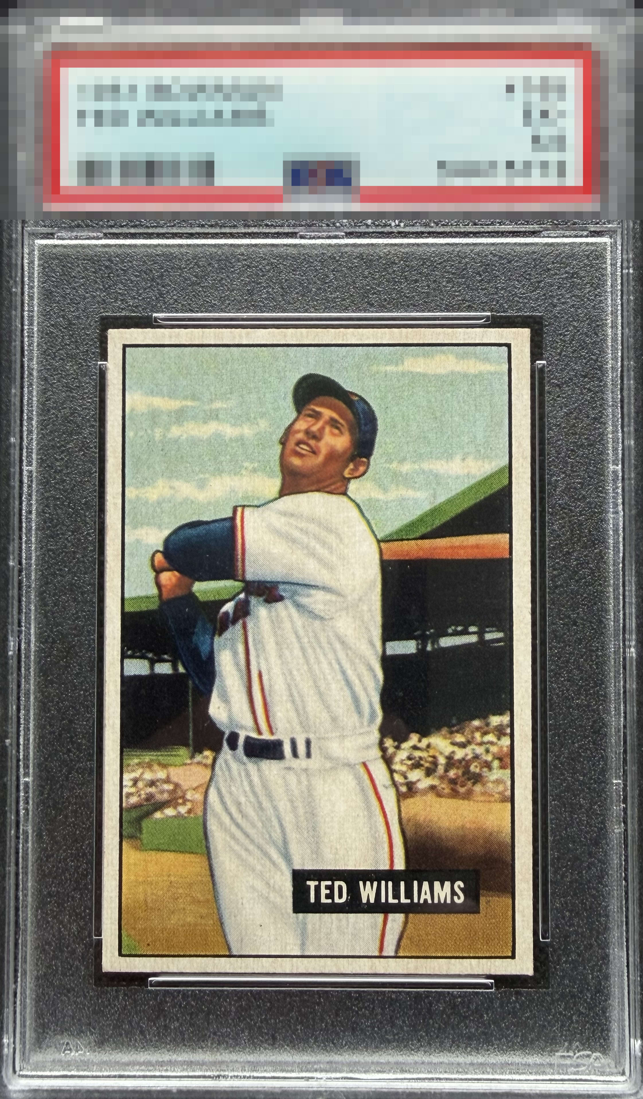
1951 Bowman Ted Williams #165
Reviews & Discussions
14 total reviews

What a brilliant example of a 1951 Bowman. These are among my favorite vintage designs, and this copy showcases exactly why. The contrast between Ted Williams and the deep black background is exceptional, giving the portrait remarkable presence. Print registration is outstanding, the corners are clean and sharp, the colored border remains rich and vibrant, and the centering is excellent. In my opinion, this is about as good as a ’51 Bowman gets. Welcome to God Tier Ted.


What a beauty. There’s so much to like about this copy. When a ’51B comes together like this, it’s hard to beat.

A mm of side centering if that but so what is my gut feeling here! This is an eyeball massage!


A- Color surface & registration A Centering I bet from 18” away this card looks like a rock star. Only flaw is slight front surface paint loss which is common on 1950 to 52 Bowman.

great looking cad with amazing eye appeal. Love the big bold borders and how strong the image is

Stunning example of the "Splendid Splinter". Just misses God Tier with my eyes as the centering is slightly heavy to the right and the name plate has a touch of PD just below the end of his name with faded black. Nothing overly distracting and a beautiful image. Congrats to the owner of this card.

EyeQ+

EYEQ+ TROPHY CASE


Rating Distribution
14 total reviews
Razor sharp. Tiny bit of tilt but very difficult to improve on.