1953 Topps Satchell Paige #220
1 / 2

Click to enlarge
💬
Reviews & Discussions
8 total reviews

Eye appeal remains in the solid second tier as the flaws don't hammer the image. Centering makes the most impact to me followed in the distance by corner wear.


Obvious wear but card still has a presence with no noticeable creases along with decent centering which keeps this in the B tier.


Corners and edges are rough but the image is clear. Centering is fair and slightly OC but nothing crazy.

nice mid grade example with nice colors and image with off centering and lots of wear around corners and edges
Locked
1 review
EyeQ+
141.0
Global Population
9
POPULATION ACROSS ALL GRADES AND GRADING COMPANIES
Global Eye Rank
#4
Population in Grade
4
POPULATION IN THIS GRADE ACROSS ALL GRADING COMPANIES
Eye Rank in Grade
#3
EYEQ+ TROPHY CASE
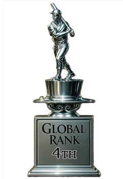
4th Place
GLOBAL
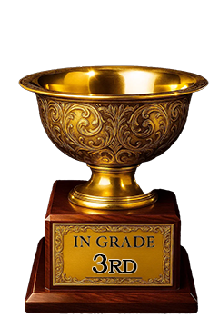
3rd Place
IN-GRADE
📊
Rating Distribution
8 total reviews
G
0%
A+
0%
A
0%
A-
0%
B+
0%
B
4 ratings
57%
4
B-
3 ratings
43%
3
C+
0%
C
0%
C-
0%
D+
0%
D
0%
D-
0%
F
0%
I'm a sucker for any '53T with a clean image and nice color. I notice some wear around the corners, and the centering looks just a touch off, but the overall presentation still does it for me.