1956 Topps Sandy Koufax #79
1 / 2
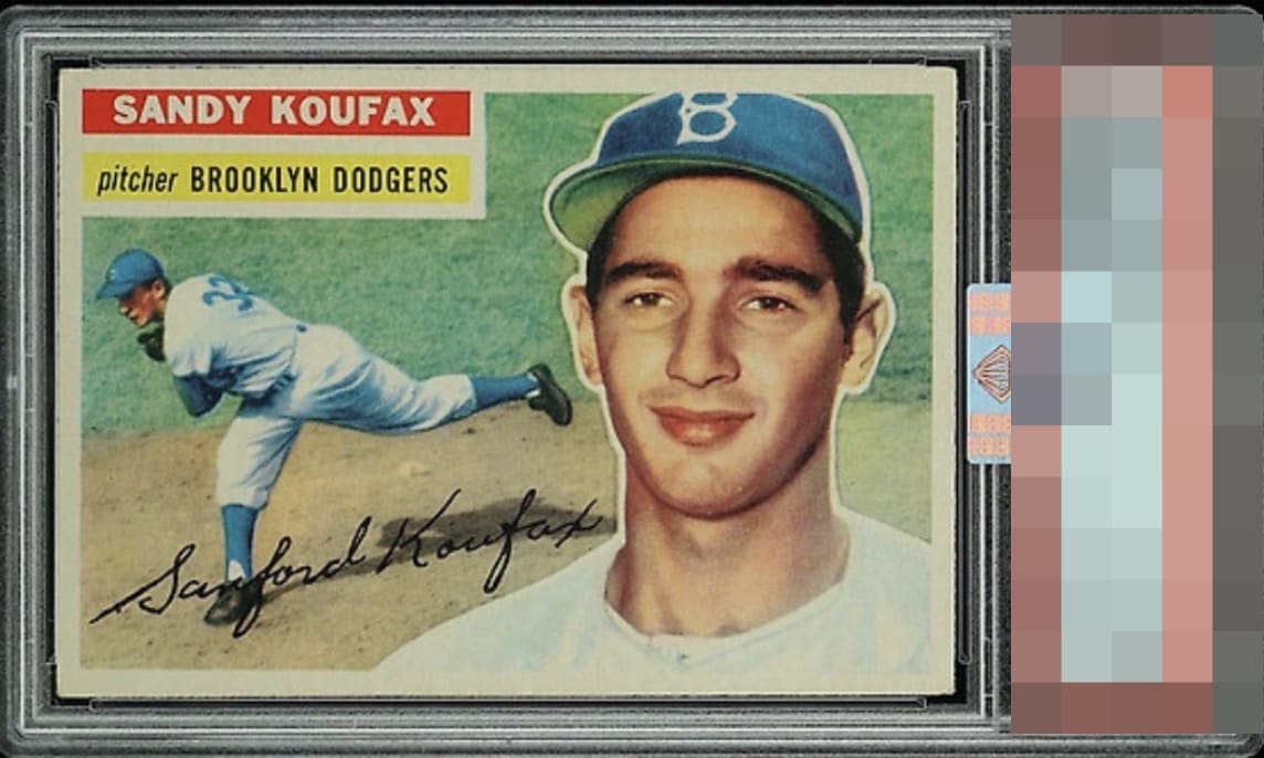
Click to enlarge
💬
Reviews & Discussions
10 total reviews

Well centered 56 Koufax here, with a slight tilt. The color feels a bit muted as well, but strong eye appeal regardless.

Card says A-Tier on first glance. The entering tilt is noticed but does not Taki it out of the A-tier.


Top tier looks for my taste; a touch of tilt top-to-bottom is the one issue that bumps my eye.

Centering is good with a bit of a tilt. No major flaws but toning is noticeable around all borders and has muted the color a little.

nice card with the inner colors and image looking good. Center is a minor opportunity but toning mutes the colors as you get closer to borders

Locked
1 review
EyeQ+
136.0
Global Population
10
POPULATION ACROSS ALL GRADES AND GRADING COMPANIES
Global Eye Rank
#2
Population in Grade
2
POPULATION IN THIS GRADE AND GRADING COMPANY
Eye Rank in Grade
#2
EYEQ+ TROPHY CASE
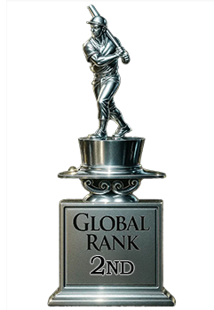
2nd Place
GLOBAL
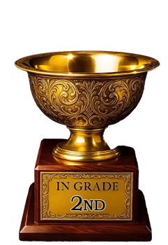
2nd Place
IN-GRADE
📊
Rating Distribution
10 total reviews
G
0%
A+
0%
A
2 ratings
22%
2
A-
4 ratings
44%
4
B+
3 ratings
33%
3
B
0%
B-
0%
C+
0%
C
0%
C-
0%
D+
0%
D
0%
D-
0%
F
0%
Good centering with great color and surface. Corner wear is a minor quibble. Slight tilt is what pulls it back for me from the highest tiers