1965 Topps Sandy Koufax #300
Reviews & Discussions
10 total reviews

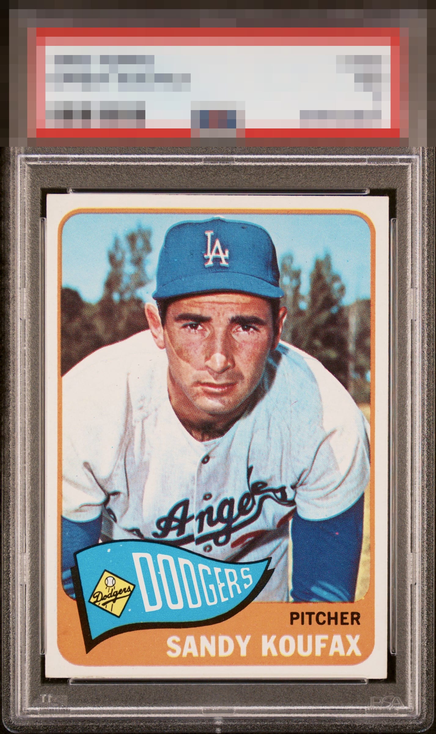
Awesome 1965 Koufax with strong color contrast, ideal centering, and a clean surface that creates immediate visual appeal. Bold nameplate presentation further enhances the overall look. Slightly soft registration and a handful of small white specks in the background hold back from higher grade.

The dots in the blue and little registration offset holds this back a bit.


We've got some surface issues going on, but the rest of this card holds great.

Love the centering on this card with just a bit top heavy. Touches on the corners but not very noticeable. Some minor print defects located on the lower 1/4 of the front keeps this from a higher grade.

Nicely centered and just a clean looking card. A few minor print defects are the only issue.

Some print issues in the blue are all I can see. Everything else screams perfection

nothing about this series shouts out the cards. But it is a clean card with good centering and a nice image. Nothing POPs but nothing distracts

EyeQ+
EYEQ+ TROPHY CASE


Rating Distribution
10 total reviews
Top tier eye appeal with superb centering. Minor PD and registration blur (most visible in the top edge of the cap) make some impact.