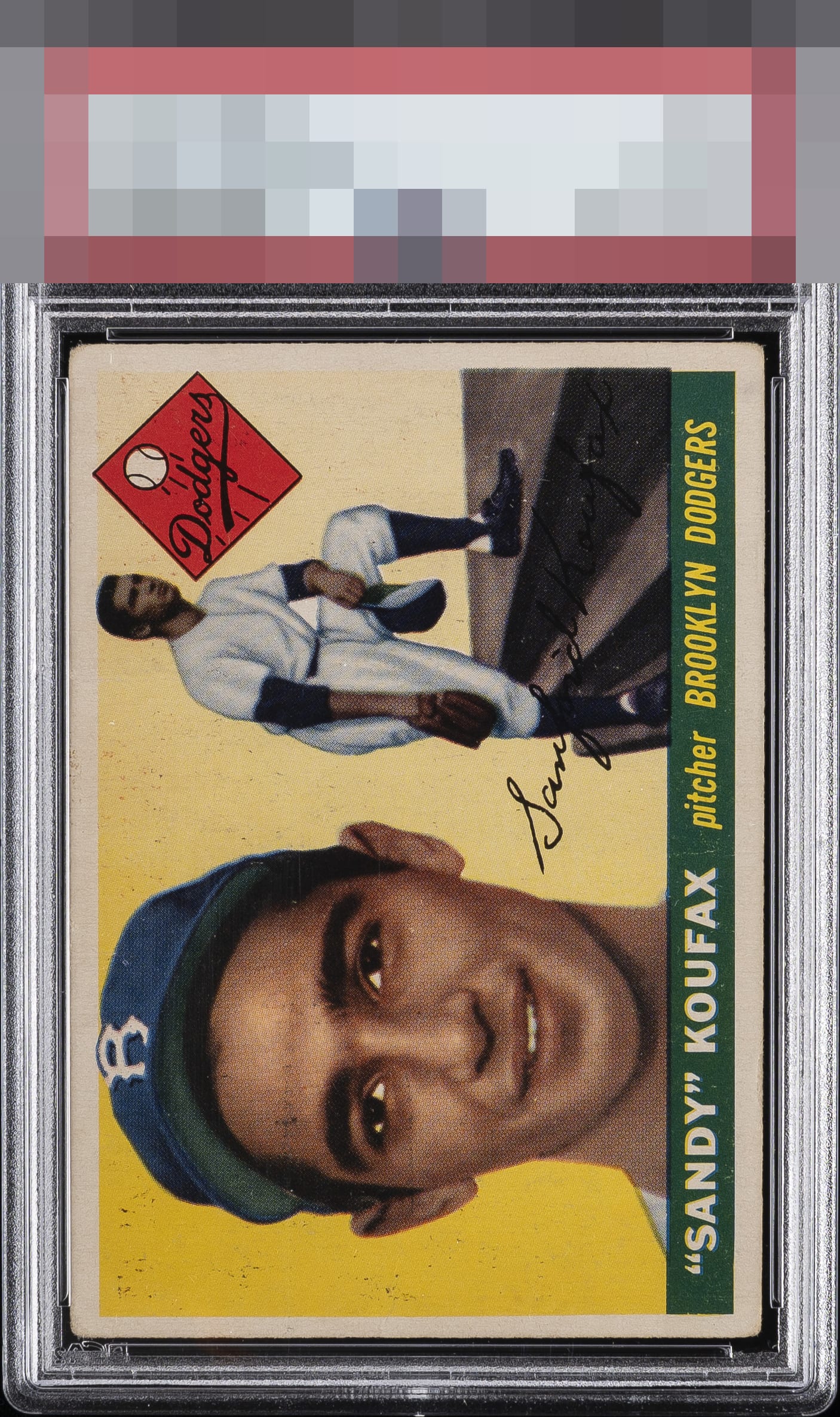
1955 Topps Sandy Koufax #123
1 / 2
Click to enlarge
💬
Reviews & Discussions
10 total reviews

Print dots are common and corners show wear but the centering, image, and colors are excellent making for a great card with attractive eye appeal.

It's the PDs on Sandy's that do the most damage to the evaluation. That said, the registration, centering, corners are issues.

Even with the obvious PD crd presents well due to centering and rich colors. Just sneaks into the A-tier for me.

the appeal is limited to the surface wear and spots but it is limited by the nice colors on the card


Great centering is counterbalanced by notable stray black print, yet the overall impression lands in the good zone for me.
Locked
3 reviews
EyeQ+
137.0
Global Population
28
POPULATION ACROSS ALL GRADES AND GRADING COMPANIES
Global Eye Rank
#2
Population in Grade
3
POPULATION IN THIS GRADE AND GRADING COMPANY
Eye Rank in Grade
#2
EYEQ+ TROPHY CASE
2nd Place
GLOBAL

2nd Place
IN-GRADE
📊
Rating Distribution
10 total reviews
G
0%
A+
0%
A
0%
A-
1 rating
14%
1
B+
1 rating
14%
1
B
0%
B-
3 ratings
43%
3
C+
1 rating
14%
1
C
1 rating
14%
1
C-
0%
D+
0%
D
0%
D-
0%
F
0%
Good tier eye appeal. The excess black print and centering followed by corners definitely make impact, but not enough to enter the C Tier.