1961 Topps Roger Maris #2
1 / 2
💬
Reviews & Discussions
7 total reviews
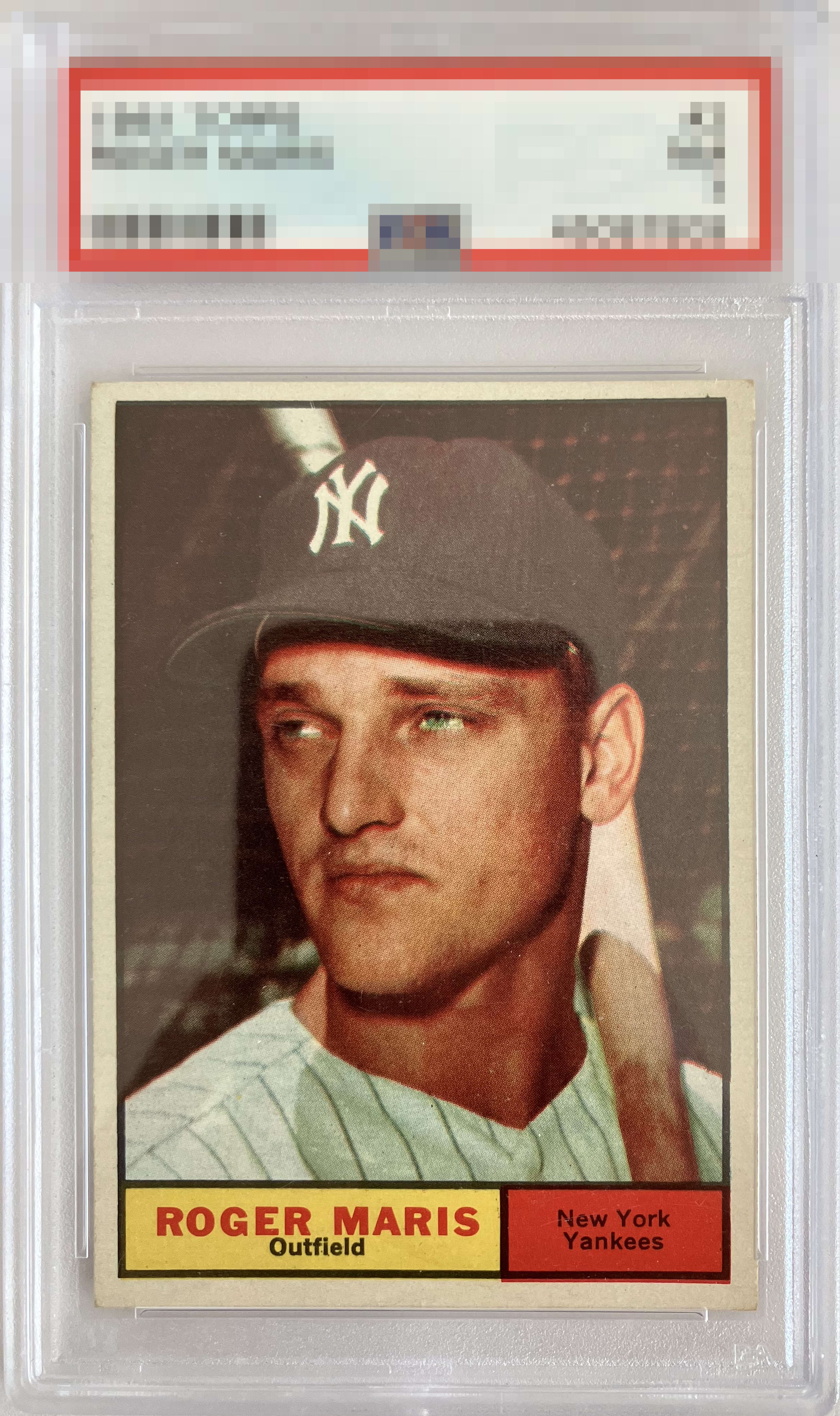
The unfortunate cell phone reflection in the image must be noted -- scans are always optimum, fellas. Let's keep the gallery sexy ;) ! On the card itself: mild centering and corner wear, with some red underbleed from the team box into the bottom border. None of it gets in the way of the overall good looks. Nice B+ eye appeal for me.
5 reviews
2 reviews
EyeQ+
--
Global Population
2
POPULATION ACROSS ALL GRADES AND GRADING COMPANIES
Global Eye Rank
—
No Eye Q+ score
Population in Grade
1
POPULATION IN THIS GRADE ACROSS ALL GRADING COMPANIES
Eye Rank in Grade
—
No Eye Q+ score
EYEQ+ TROPHY CASE

GLOBAL

IN-GRADE
Trophies appear here when earned.
📊
Rating Distribution
7 total reviews
G
0%
A+
0%
A
0%
A-
1 rating
20%
1
B+
2 ratings
40%
2
B
2 ratings
40%
2
B-
0%
C+
0%
C
0%
C-
0%
D+
0%
D
0%
D-
0%
F
0%
Nicely centered but some registration/focus issues that distract my eye. You can see the issue in his eyes with the focus/registration. Also the red shift of color in the red nameplate is distracting.
