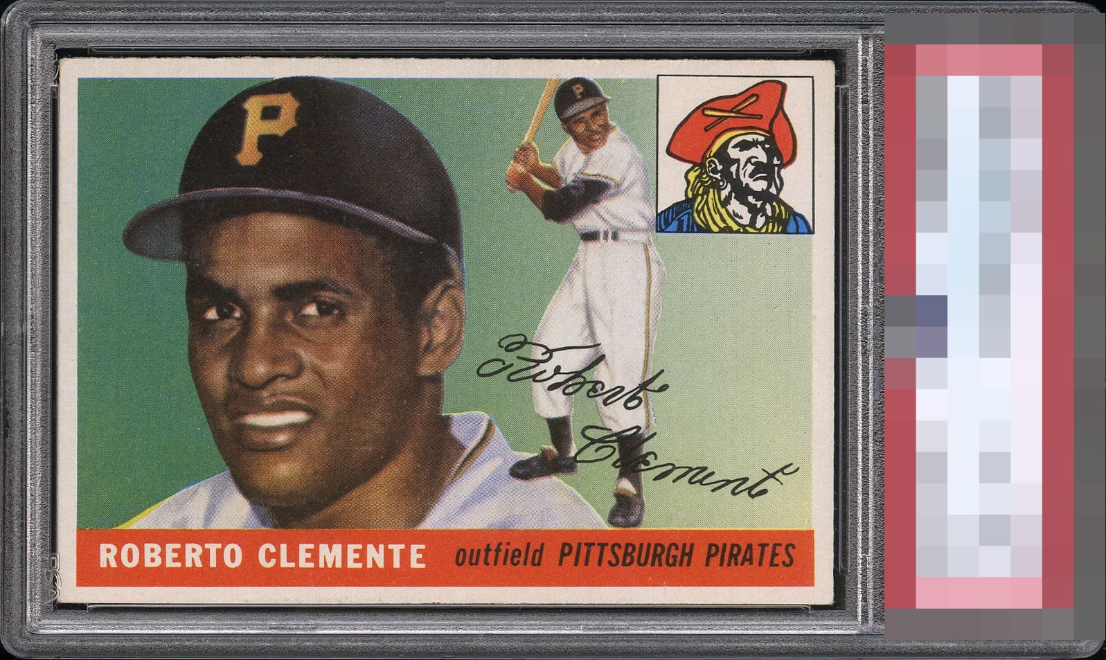
1955 Topps Roberto Clemente #164
Reviews & Discussions
8 total reviews

Eye-appeal is obvious on first glance. Centering is good enough for the A tier along with no major distractions to the eye. A card I would love to have in my collection. It will be interesting to see the grade on this one. Corner wear is noticeable but not overly distracting.

This card has it all - centering, color, image, focus…easily looks like a card 1-2 grades higher. Any collector would love to own this card.

Centering is very good for this issue, not quite 50/50 but close enough for me. No issues that bother me. I'd buy this.

IF the card was a little brighter it would be a Wow card. As is it is really pleasing to the eye with solid image and colors


This is a really clean and handsome copy. Centering is a click off, but I can't deny the overall good looks here.
EyeQ+
EYEQ+ TROPHY CASE


Rating Distribution
8 total reviews
Ive been actively shopping this card for the past 9-12 months. Had I found an example like this, I would have purchased immediately. Everyone knows how tough the centering is on the 55 Topps and this example is A+, coupled with strong corners and great registration, this is top tier for me. Huzzah!