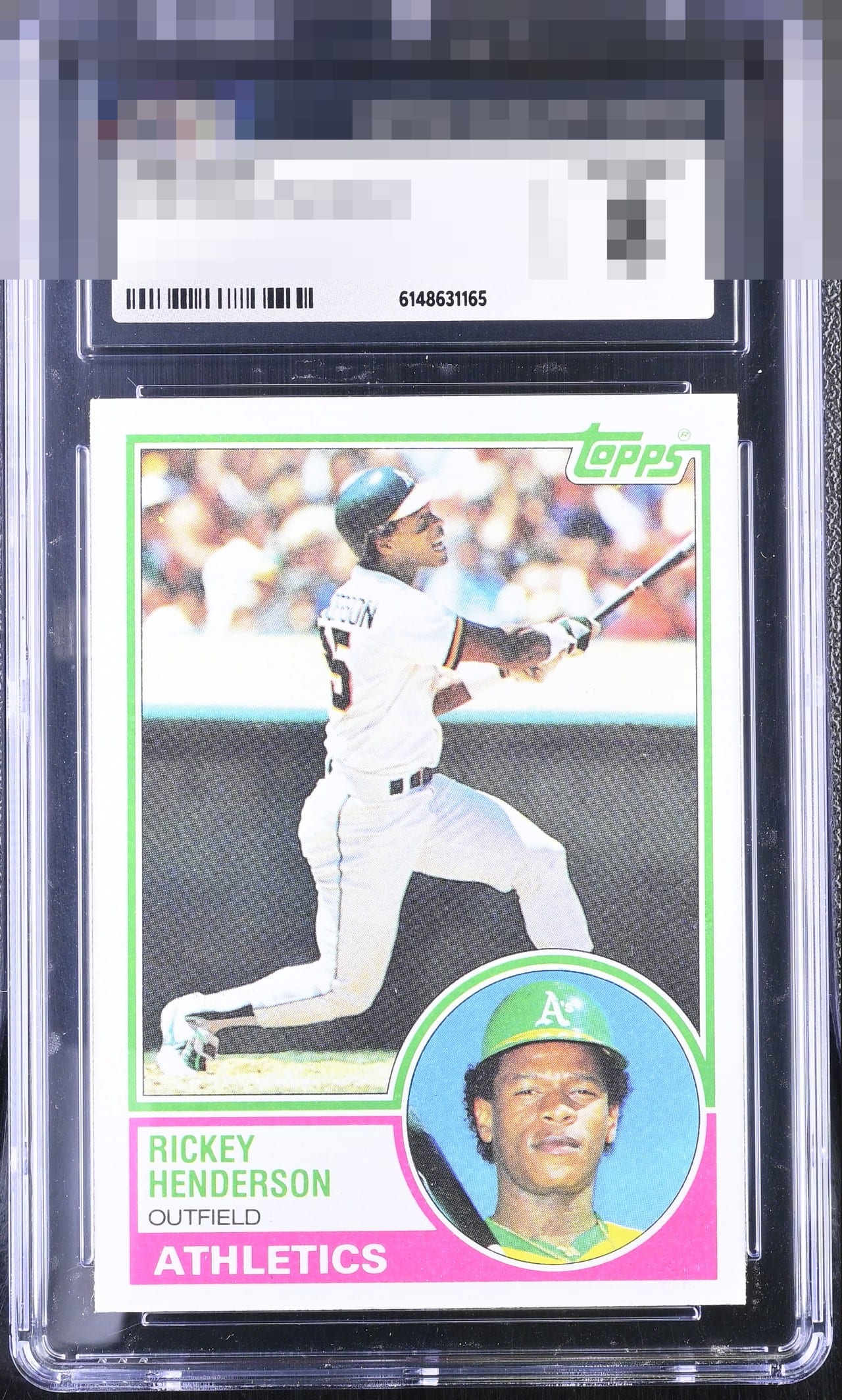
1983 Topps Ricky Henderson #180
1 / 2
Click to enlarge
💬
Reviews & Discussions
10 total reviews

A centering shift is the lone flaw of consequence that I detect. Visual appeal is confirmed.

Centering is off just enough to keep this card from the A tier. Nice corners and color.

Color looks a little washed out, could be scanner setting, but there are no big eye appeal problems here. Centering toward the bottom makes some impact. Very good eye appeal on a pack fresh looking card.

No loud flaws to my eye. Centering is off just a hair and along with some overall fading makes modest impact.


I like bright cards but this is to bright that it took away from the image and color qualities add in the centering opportunities and it is limited in its appeal
Locked
3 reviews
EyeQ+
97.0
Global Population
1
POPULATION ACROSS ALL GRADES AND GRADING COMPANIES
Global Eye Rank
#1
Population in Grade
1
POPULATION IN THIS GRADE ACROSS ALL GRADING COMPANIES
Eye Rank in Grade
#1
EYEQ+ TROPHY CASE

1st Place
GLOBAL

1st Place
IN-GRADE
📊
Rating Distribution
10 total reviews
G
0%
A+
0%
A
0%
A-
0%
B+
5 ratings
71%
5
B
2 ratings
29%
2
B-
0%
C+
0%
C
0%
C-
0%
D+
0%
D
0%
D-
0%
F
0%
Nice card with a slight centering shift that keeps it just out of the A range for me.