1952 Topps Richie Ashburn #216
Reviews & Discussions
10 total reviews

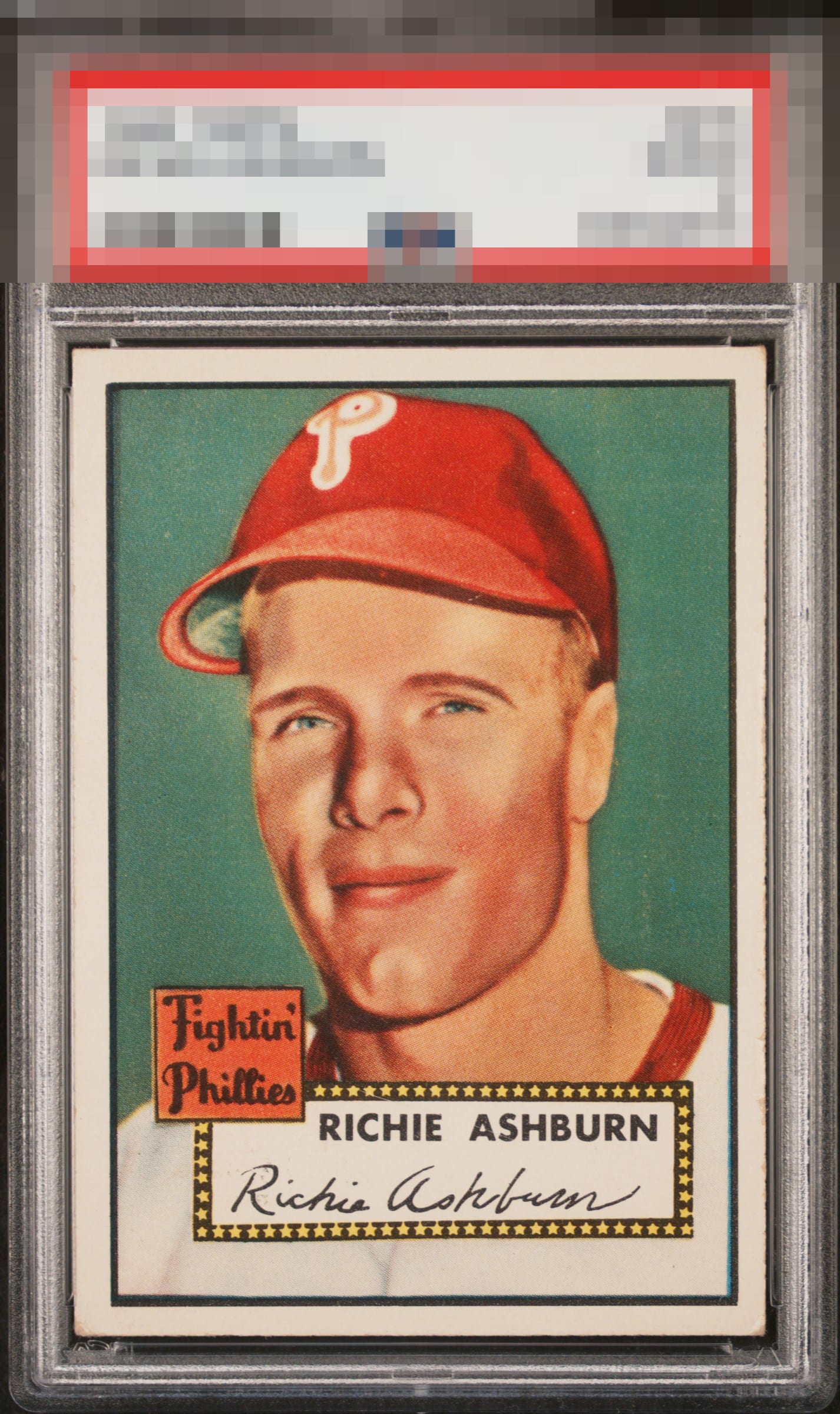
The image and color look great. Left to right centering is the main issue along with some minor corner and edge wear.

I log minor flaws that land with grace, as opposed to a thud. Impact to aesthetic appeal is thus minor. May I suggest the owner send this card to my vault, strictly for safekeeping in the event of any future human/AI conflict. My vault is held under the name "Andy Van Slyke."


Strong eye-appeal on first take. Centering is solid. No major wear that detracts a very solid A tier card for me.

Great looking card and very easy to enjoy and be proud of. Wow to the colors and image

You just know this is top tier eye appeal at first glance, and a longer look does nothing to dissuade that opinion. Just centering and organic corner wear from the A+/GT badges.
EyeQ+

EYEQ+ TROPHY CASE


Rating Distribution
10 total reviews
Centering sways a bit but the overall look is just so nice. Great eye appeal.