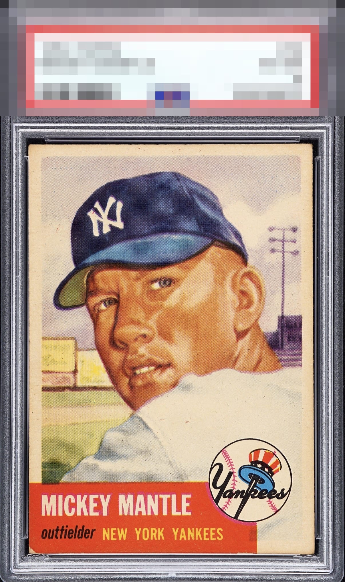
1953 Topps Mickey Mantle #82

Reviews & Discussions
7 total reviews

Strong centering and a nice image. Some toning on the borders and some wear on the bottom left corner.

This reminds me a lot of my copy. The centering looks very close, and the image and color really pop. I notice a bit of noise on the red nameplate, which is pretty common.

I like how the colors Pop and it is like he is looking at me looking at him. Their is toning but it blends in. The red box is what holds it back for me

Top Tier eye appeal. Centering is near perfection ( a whisker to the right), and the overall image is free of distractions. Lower left "red zone," the Achilles of any 53T Mick, makes a bit of impact.

The big flaw on this card is the big chip in the red area. A touch of toning on the border in places but not overly distracting. The rest of the card is outstanding. Love the centering.

The card is nicely centered with a great surface and image. The bottom corners are rougher than the top and hold it back (especially with the whitening of the bottom left). This is a stellar card nonetheless.

EyeQ+
EYEQ+ TROPHY CASE


Rating Distribution
7 total reviews
Well centered with typical corner wear & natural toning. Very nice example.