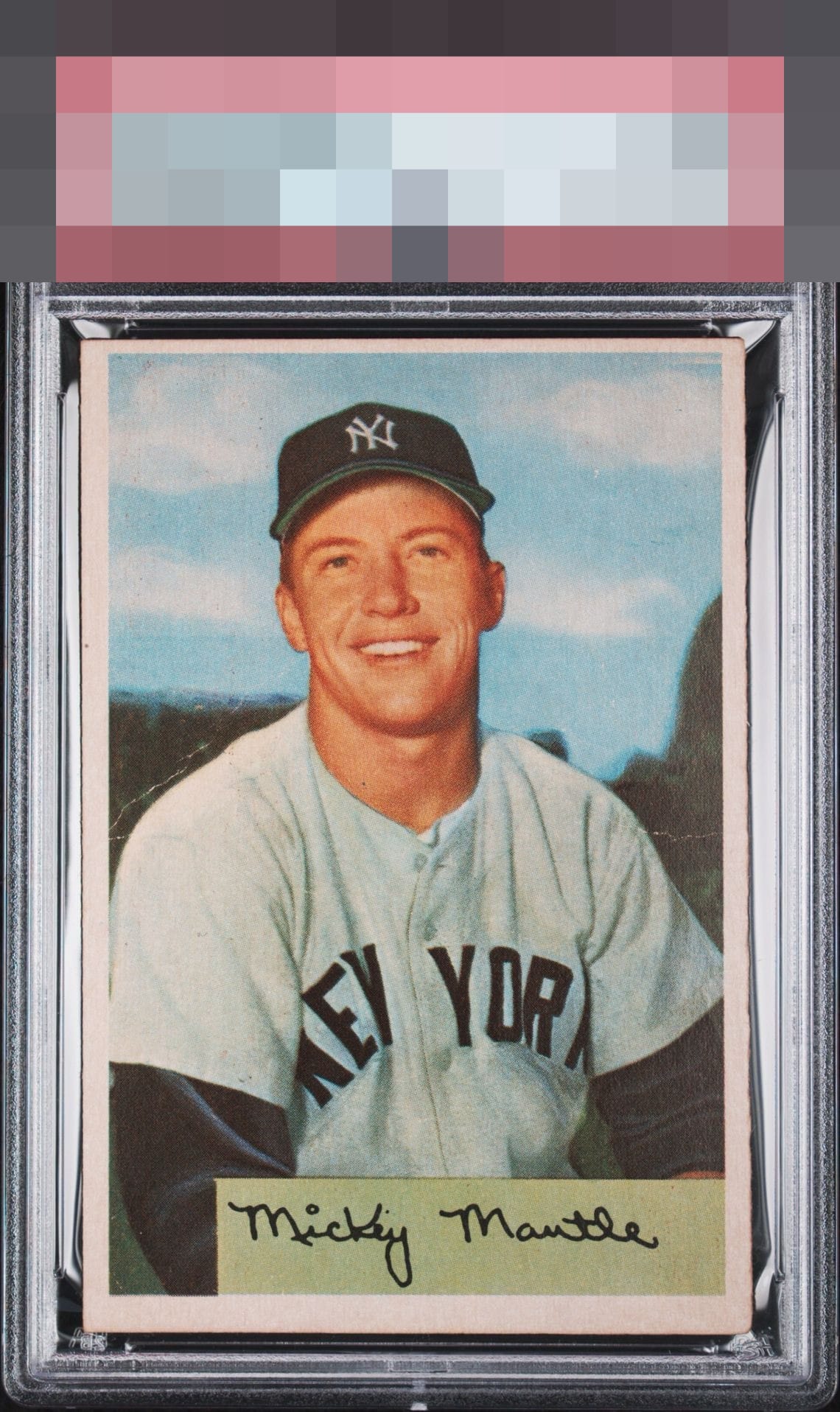
1954 Bowman Mickey Mantle #65
Reviews & Discussions
8 total reviews

The centering top-bottom really jumps out to me on this card. I also notice the 2 creases but they do not jump off the card at me. The card still holds some solid eye-appeal to me.

This is a great looking low grade copy! The centering on sides brings it up for me

image is nice and colors are good. But a bit to off centered and surface wear to make the Grade

The subtleness of the creases is clutch and essentially the "Bank error in your favor card" from Monopoly. Enjoyable image, centering shifted so much relegates eye appeal to the B tier.

Shift towards the bottom catches the eye. Creases are well located but noted. Side to side and image is excellent. Nice card with strong eye appeal of the Commerce Comet.

The creasing and centering are the only detractions. The central image looks great.
EyeQ+
EYEQ+ TROPHY CASE

Rating Distribution
8 total reviews
The image and color carry this to a respectable eye appeal range for me, despite the top-to-bottom centering and subtle crease.