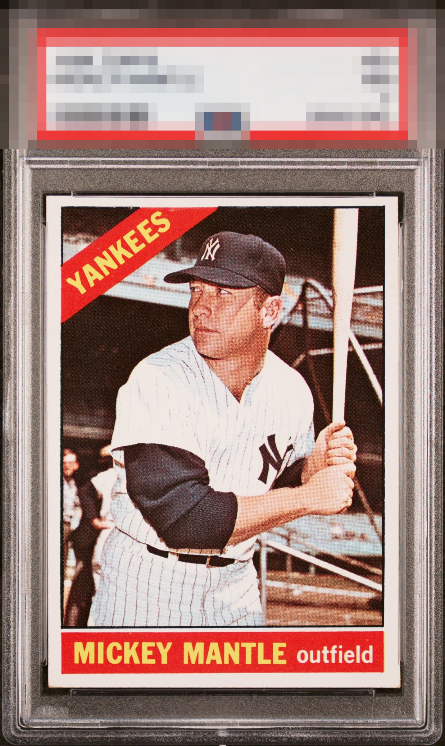
1966 Topps Mickey Mantle #50

Reviews & Discussions
10 total reviews


Fantastic registration and color. Just a slight shift in centering to note.

Great registration. Love how focused and crisp the image is. Centering is holding it back for me from the next tier.

Love the overall look and the opportunities are minor and not noticeable by all the surface wear blends in and the colors and image are solid. Borders are nice sized but off centered but they are nice and bright and the card has a slant


Centering is the only drawback to eye appeal on this card, for my taste. The rest is A+. Good looking Mantle.

I love when a 66 Mick does not have any PD in the red, or the black parts of the background. This card can also often suffer from focus issues. None of those usual flaws are present here, and the centering is solid on the sides. A northward shift is all that impedes the eye appeal train here. Solid A.

EyeQ+
EYEQ+ TROPHY CASE


Rating Distribution
10 total reviews
Card color really pops. Centering is good enough for me to take another look. Strong all-around example would be happy to have this in my collection. Corners, while showing some touches don't bother me.