1968 Topps Mickey Mantle #280


Reviews & Discussions
12 total reviews

Centering is off enough to my eye to take notice along with some minor pd in the cap area and other random spots. This card lands in the B tier for my eye.

Top tier eye appeal, driven primarily by that pinpoint focus in the cap area-- many can be blurry. The burlap design of the '68 set is a favorite of mine in terms of masking corner wear, and that unique attribute is on display here. Centering favoring the left side makes some impact.

A touch off-centered with subtle tilt but everything else looks very nice.

At first glance, a very attractive example of this card. The thing I love about the 68 Topps cards is I don’t really ever notice corner wear due to the border design. There is a slight diamond cut to the card and a bit of tilt and left/right centering. Closer examination shows some slight surface imperfections, most noted in the red team circle.

simply a really nice looking card with nice borders which frame the card well to respectable centering(L/R) has an opportunity. minor print defects that effect the image quality and color and luckily they are minor

Eye appeal here cracks the top level of badges for me. Flaws are "low-volume," led by centering that is just a tad low and left-heavy. All in all an easy card to enjoy with no major distractions.
EyeQ+
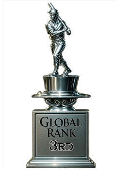
EYEQ+ TROPHY CASE

Rating Distribution
12 total reviews
Nice color and a very clear image. Centering is a little off but not bad. Minor corner wear is the only other issue I notice.