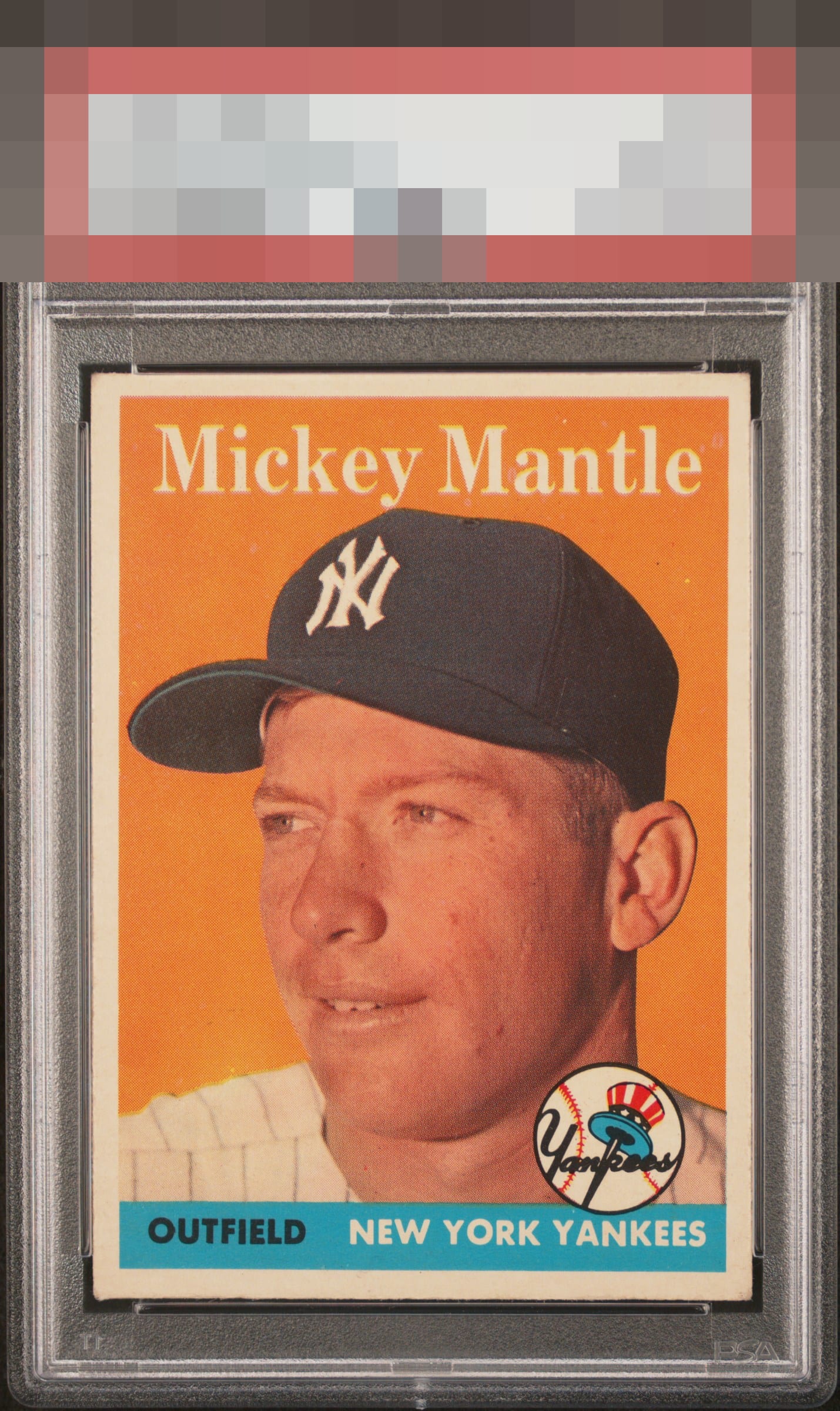
1958 Topps Mickey Mantle #150
Reviews & Discussions
8 total reviews

Stunning image with some touched corners that are noticed but not does not overly detract from the beauty. Centering is the big issue for my eye. Colors are really good on this beauty.


really like the image and the colors are sharp. The borders have some opportunity and the borders could be brighter

Outstanding registration - crystal clear image of Mantle and clean background puts it in the A tier for me. Tilt and softness of top left corner catch my eye - but image brings it right back to the photo! Nice card.

Image of Mickey looks strong. The fisheyes and the subtle tilt knock it down a bit.

Beautiful image, driven by pinpoint registration. No PD, either. Only centering and tilt make some impact. High end for sure.
EyeQ+
EYEQ+ TROPHY CASE


Rating Distribution
8 total reviews
The lone factor keeping this from a solid A is tethered to the centering of this card, which is still well above average among other examples from the 56 Topps set. Color and registration also perform well above what you typically encounter with this particular card, and the color palette largely negates what would otherwise be noticeable/distracting fisheyes in the print relative to other cards with colors that accentuate those flaws. Overall, a genuinely lovely card that checks all the boxes for being easy on the eyes