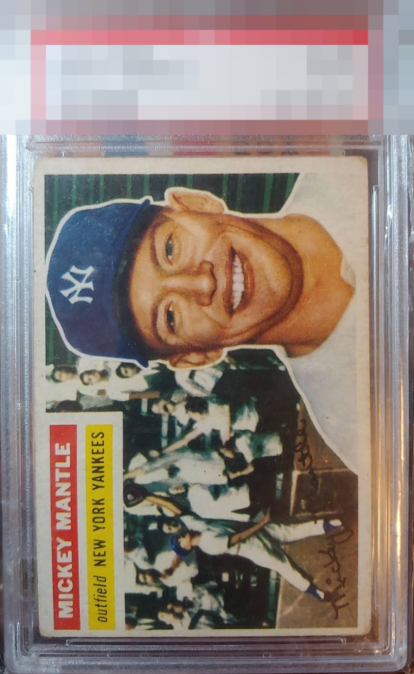
1956 Topps Mickey Mantle #135
1 / 2
Click to enlarge
💬
Reviews & Discussions
14 total reviews


card is some ones proud baby. But the border wear and surface wear hold back the true beauty of this baby

A rougher copy but centered one. The edges and surface show the love. The color stays strong.

Obvious corner wear with centering being off a little too much for me keeps the card at a B-

The Mick's smiling portrait and leaping play can be enjoyed without jarring issues such as creases or PD, which is clutch. Centering and organic corner wear impair eye appeal a bit.

A clean, problem-free surface and imagery lead to eye appeal that hangs in the B Tier for me. Centering is the main aspect that impacts aesthetics, followed by corner wear.
Locked
4 reviews
EyeQ+
109.0
Global Population
26
POPULATION ACROSS ALL GRADES AND GRADING COMPANIES
Global Eye Rank
#22
Population in Grade
3
POPULATION IN THIS GRADE ACROSS ALL GRADING COMPANIES
Eye Rank in Grade
#2
EYEQ+ TROPHY CASE

GLOBAL

2nd Place
IN-GRADE
📊
Rating Distribution
14 total reviews
G
0%
A+
0%
A
0%
A-
0%
B+
0%
B
0%
B-
5 ratings
50%
5
C+
4 ratings
40%
4
C
1 rating
10%
1
C-
0%
D+
0%
D
0%
D-
0%
F
0%
The image and surface are higher tier while centering and corners affect eye appeal.