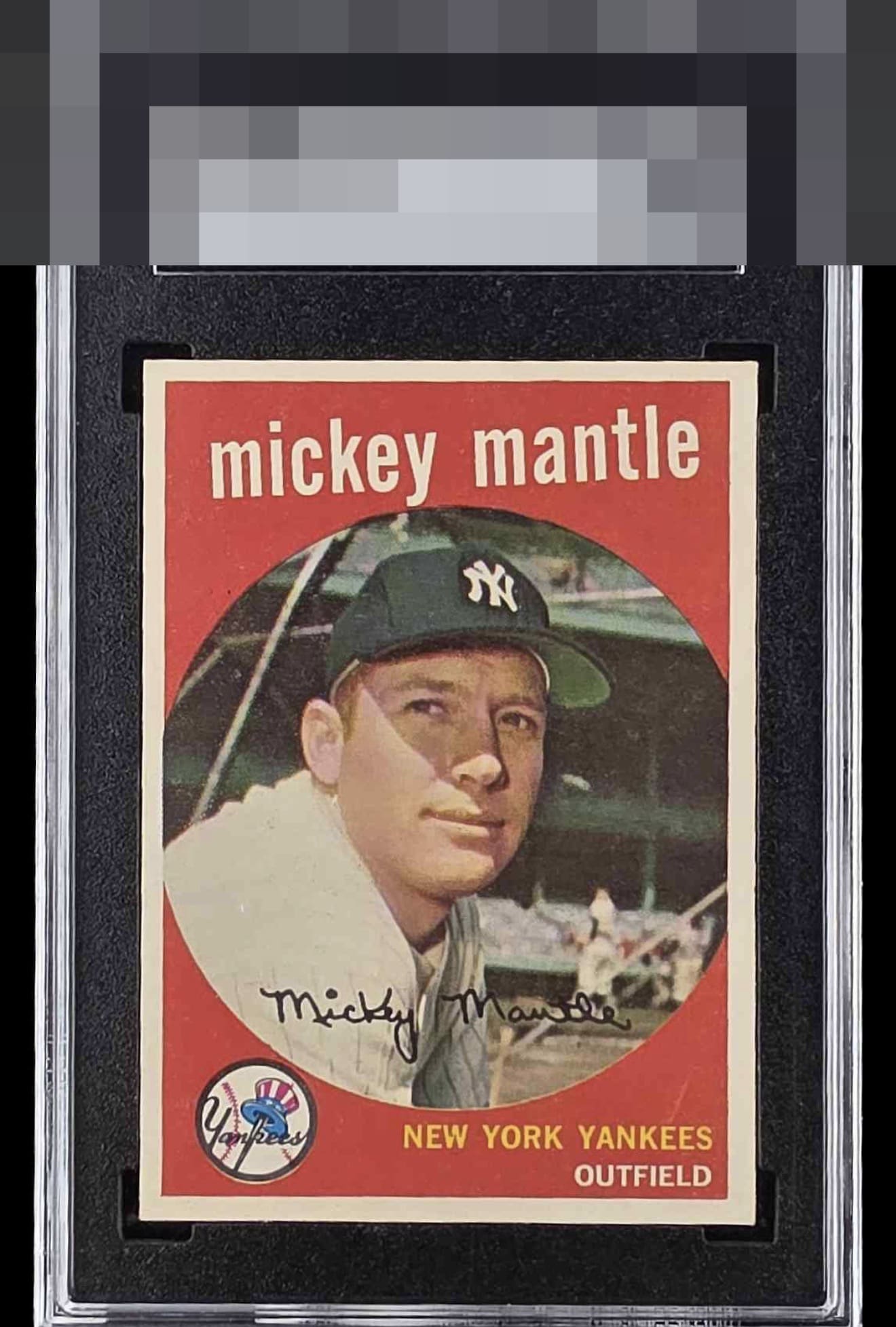
1959 Topps Mickey Mantle #10
1 / 2
Click to enlarge
💬
Reviews & Discussions
9 total reviews


Centering is a little off left to right, but still decent. A few minor surface issues, but looks great overall.

Nice thick, white borders slightly favoring to the bottom and right that catches the eye slightly. Pretty clean print with a few dots in the red and a blemish above the E in Yankees. Clean back. Beautiful, clean, crisp card with nice eye appeal.

nice looking card. Nothing Pops but the cards image and colors work well together

A good looking card. A touch off-centered and a few minor surface blemishes.

A very good example with a standout image (comparing reveals how blurry his face and cap can be) and largely clean red. Centering dampens eye appeal a bit.
Locked
2 reviews
EyeQ+
136.0
Global Population
23
POPULATION ACROSS ALL GRADES AND GRADING COMPANIES
Global Eye Rank
#5
Population in Grade
3
POPULATION IN THIS GRADE ACROSS ALL GRADING COMPANIES
Eye Rank in Grade
#3
EYEQ+ TROPHY CASE
5th Place
GLOBAL

3rd Place
IN-GRADE
📊
Rating Distribution
9 total reviews
G
0%
A+
0%
A
1 rating
14%
1
A-
2 ratings
29%
2
B+
4 ratings
57%
4
B
0%
B-
0%
C+
0%
C
0%
C-
0%
D+
0%
D
0%
D-
0%
F
0%
No major flaws and the centering while off it does not overpower the card it is still noticed. Minor paper loss on the back is of no consequence as it really does hinder reading the information.