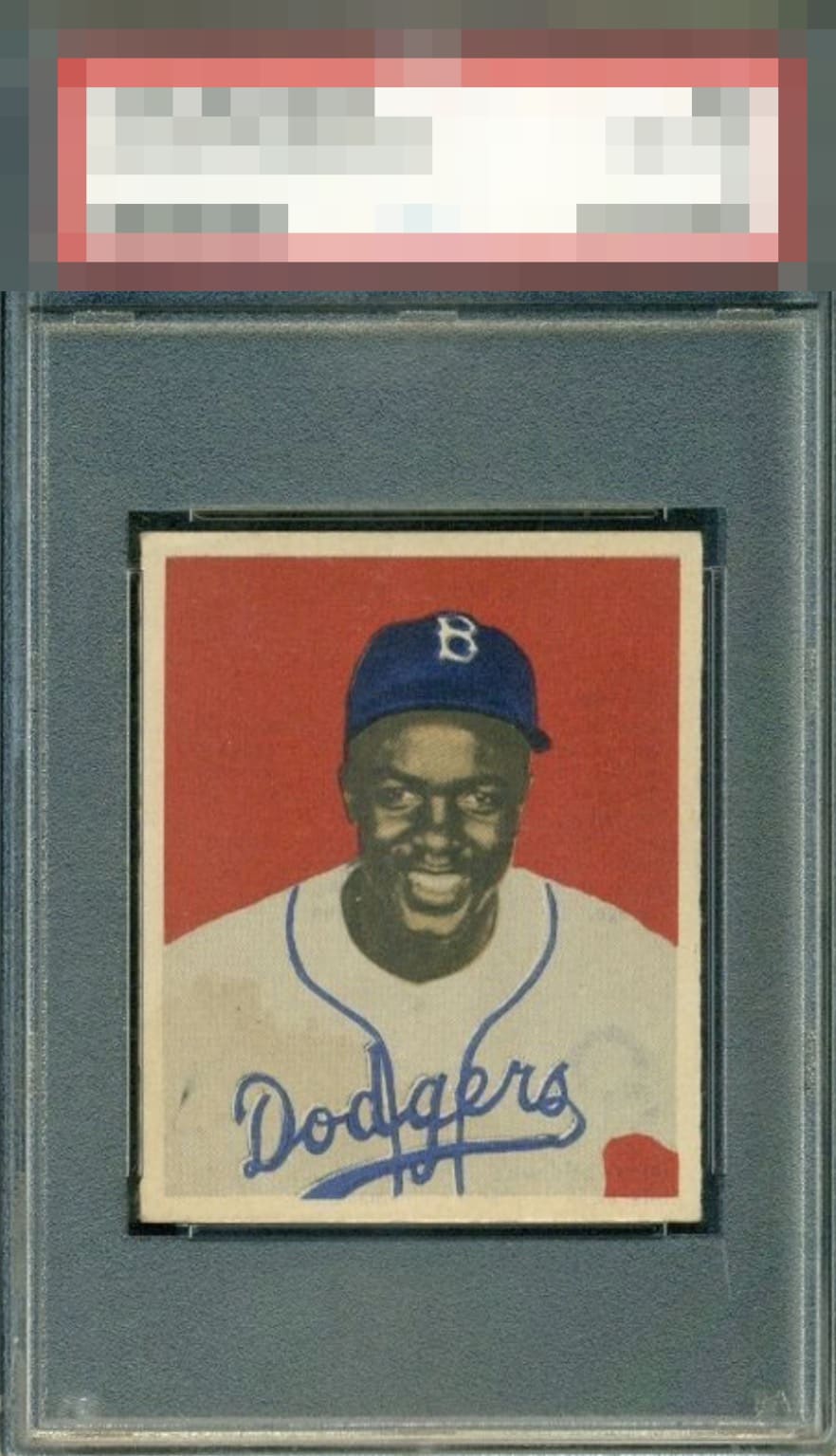
1949 Bowman Jackie Robinson #50
Reviews & Discussions
11 total reviews

Highly attractive Jackie with immediate visual balance and presence! Strong centering frames the image beautifully, while rich color and sharp registration bring Robinson's portrait to life. Facial details display with excellent clarity, creating a crisp and engaging presentation. Clean surface throughout, free from the print defects, creases, stains, or other distractions that often draw attention away from the image. Eye naturally remains focused on Robinson and the portrait itself. It is easy to engage with his face and meet his eyes. A stain along the left side of the uniform represents the one distraction to me. Noticeable upon close inspection, though it does not materially detract from display quality or visual impact. Overall, strong eye appeal, with the image carrying far greater weight than the minor stain imperfection.


Great centering and the image and background color look nice. Some surface wear and the stain in the lower left corner keep this just below A tier for me.


Great looking card with strong colors and a nice centering. Blemishes holds it back

I'll take it; message me the invoice! This is the exact copy I'd love to find and add one day-- assuming the old numerical system was sufficiently harsh on those corners to keep the cost down!

Very nice looking Jackie. A touch off on the registration but noticeable. When you couple that with the staining on the lower left keeps this one from a higher grade.

Fix the tilt/OC and the small surface blemishes on Jackie, and you’ve got a God Tier card. This is one of my favorites.

Nice red background snd well-centered. Jackie's face looks a touch out of focus. Some soiling on the bottom left keeps it from the A levels.
EyeQ+
EYEQ+ TROPHY CASE

Rating Distribution
11 total reviews
This is a tough card to find in decent shape and this more than just decent.