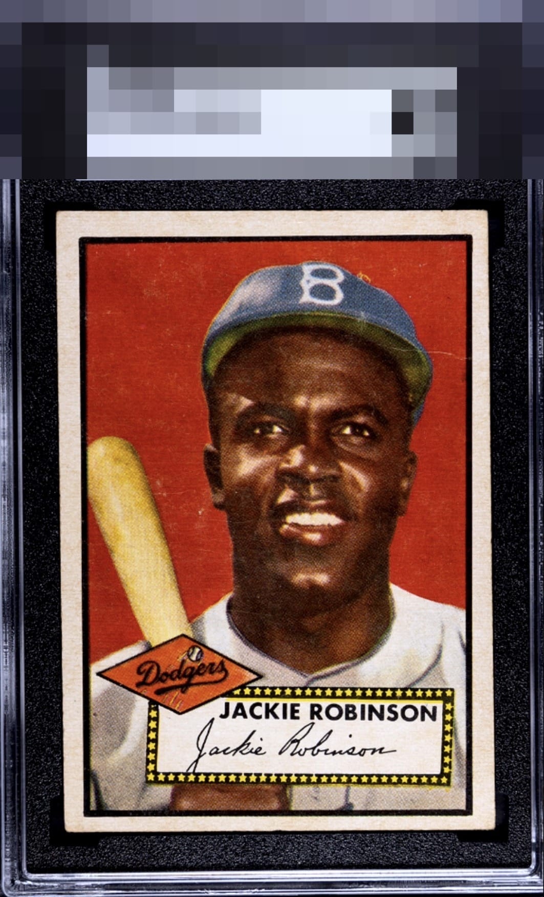
1952 Topps Jackie Robinson #312

Reviews & Discussions
11 total reviews

Centering and some tilt make more impact on eye appeal to me than the hairline wrinkle on the left, corners are fine to me. Solid mid level eye appeal.

Love the bold red colors. The centering is off just enough to distract my eye. The noticeable crease near his cap on the top right keeps this card a 2nd tier level.

Bold color and solid registration helps offset the centering and surface damage.


Amazing How Deep the Red is and great colors. Minor crease and blemishes are noticeable but does not effect the overall appeal of the card. the card looks like it has a slight tilt and is off center

Solid eye appeal with centering being the one aspect that bumps my eye. The wrinkle to the right of his head is subtle and "low volume" to my eye. Corners are not an issue for me with this degree of honest wear. Central image and borders are very pleasing.
EyeQ+
EYEQ+ TROPHY CASE

Rating Distribution
11 total reviews
Visually stunning. Color jumps off the card and the sgc tux