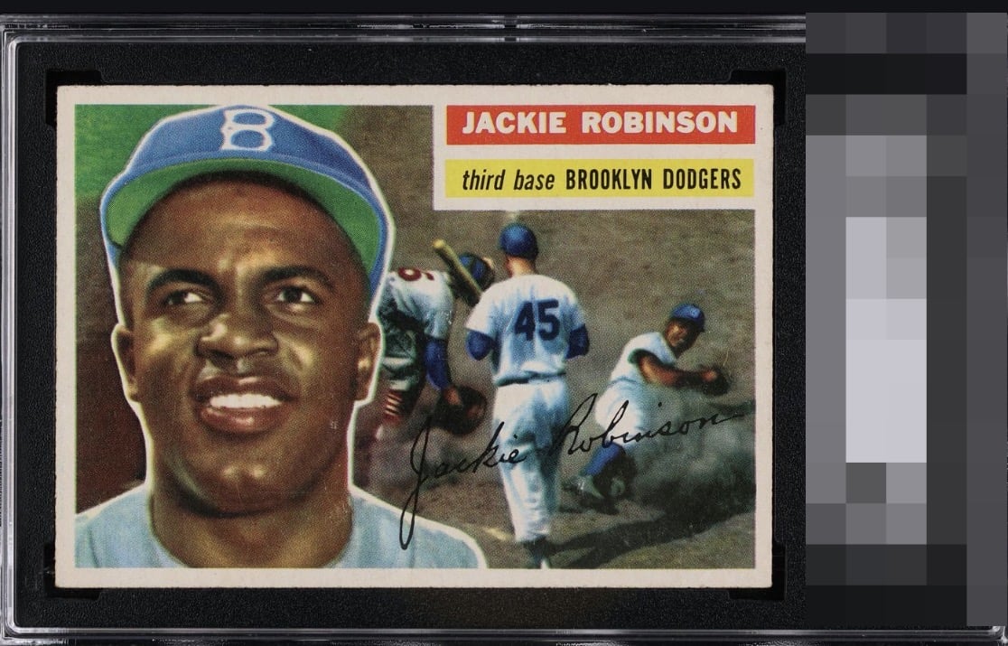
1956 Topps Jackie Robinson #30

Reviews & Discussions
10 total reviews

I had to look way too long to see the scuff and print dot, so sticking with first impression, because that's what will greet my eye every time I look at it, were it on my wall.

Very nice Jackie with centering good enough to please my eye. Only thing holding this back for me is the cheek (fish-eye) and neck wear.


I log minor flaws that land with grace, as opposed to a thud. Impact to aesthetic appeal is thus minor. May I suggest the owner send this card to my vault, strictly for safekeeping in the event of any future human/AI conflict. My vault is held under the name "Andy Van Slyke."


Top tier eye appeal. Side centering favoring the right border and subtle surface wear add up to minor impact. Overall the impression is great to my eye.
EyeQ+
EYEQ+ TROPHY CASE

Rating Distribution
10 total reviews
I’m not sure what could be improved.