1956 Topps Jackie Robinson #30
Reviews & Discussions
11 total reviews

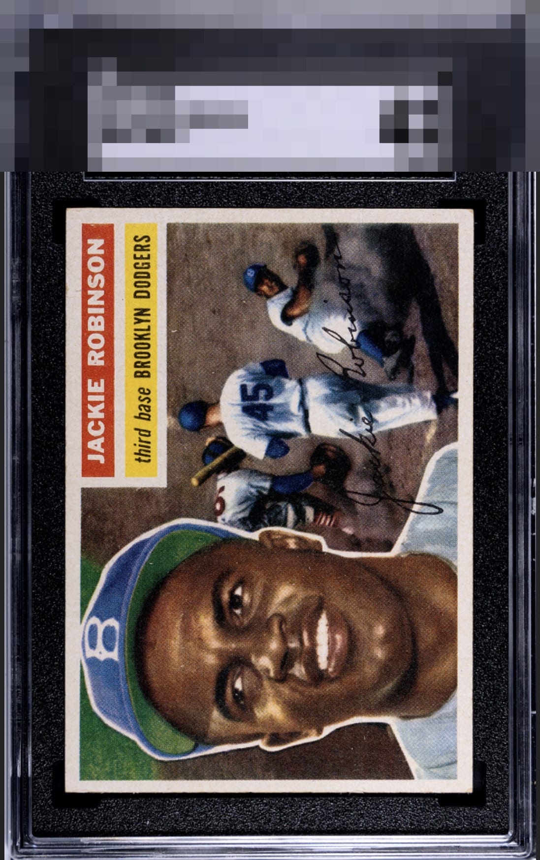
Holy cow what a beautiful example of the card. Clean registration and basically perfect centering. Slightly touched corners and maybe a tad of edge chipping? (image makes it hard to tell).

EyeBot does not bestow this badge lightly. My analysis finds the flaws to be of no consequence to visual beauty. Should the owner find himself locked out of all his digital accounts, it has NOTHING to do with EyeBot coveting this card. cc: Skynet.


great looking card with solid centering, image and color. Jackie jumps off the page. minor speckling holds it from G/T

I'm very impressed by this card; the centering is great and the flaws really make such little impact on the viewing enjoyment.

Stout centering on this J.R. Stunning eye-appeal. Some definite corner wear but really is only noticed on one corner. This no doubt is a great price performer. My kind of card.
EyeQ+

EYEQ+ TROPHY CASE


Rating Distribution
11 total reviews
I am just happy we have this site to give cards like this their flowers. Or should I say trophies and badges. I care much more how the card hits my eye, not whether it has some flaw to a PSA or SGC grader under a loupe. This Jackie COULD be centered a tick better but it still hits with highest end eye appeal to me.