1954 Topps Jackie Robinson #10
1 / 2
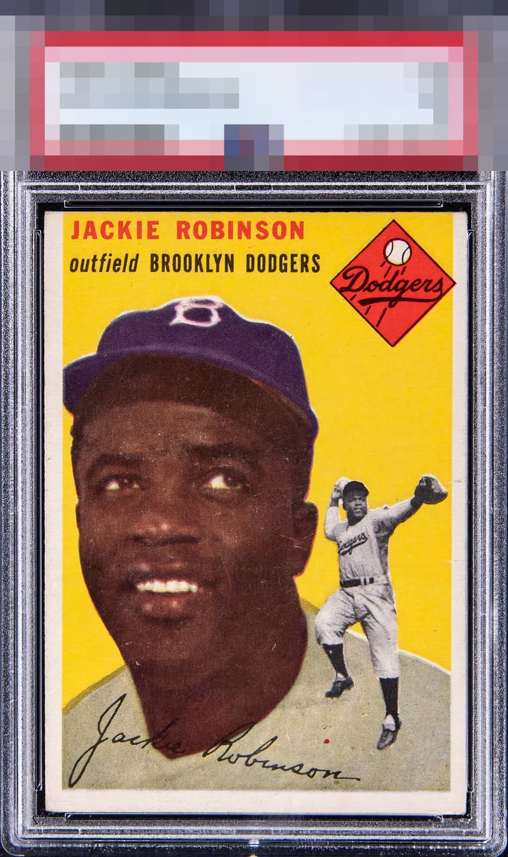
Click to enlarge

💬
Reviews & Discussions
8 total reviews


Sort of the quintessential, nice B. No flaws grab and bother me yet the centering and some stray print make an impact.

love the clean and bright borders but the off centering bothers me. The colors are nice but sadly not the main image as it is effected by to much surface wear/speckling for me

Some surface issues on Jackie's face and centering shift towards the top hold the card back a bit.

High marks for eye appeal here as it is so close to top tier yet has minor flaws, notably a little centering shift.
Locked
1 review
EyeQ+
126.0
Global Population
7
POPULATION ACROSS ALL GRADES AND GRADING COMPANIES
Global Eye Rank
#3
Population in Grade
2
POPULATION IN THIS GRADE ACROSS ALL GRADING COMPANIES
Eye Rank in Grade
#1
EYEQ+ TROPHY CASE
3rd Place
GLOBAL

1st Place
IN-GRADE
📊
Rating Distribution
8 total reviews
G
0%
A+
0%
A
1 rating
14%
1
A-
0%
B+
2 ratings
29%
2
B
3 ratings
43%
3
B-
1 rating
14%
1
C+
0%
C
0%
C-
0%
D+
0%
D
0%
D-
0%
F
0%
Solid looking card but enough flaws to keep this out of the A tier. The print issues on the face solidify this as a B tier.