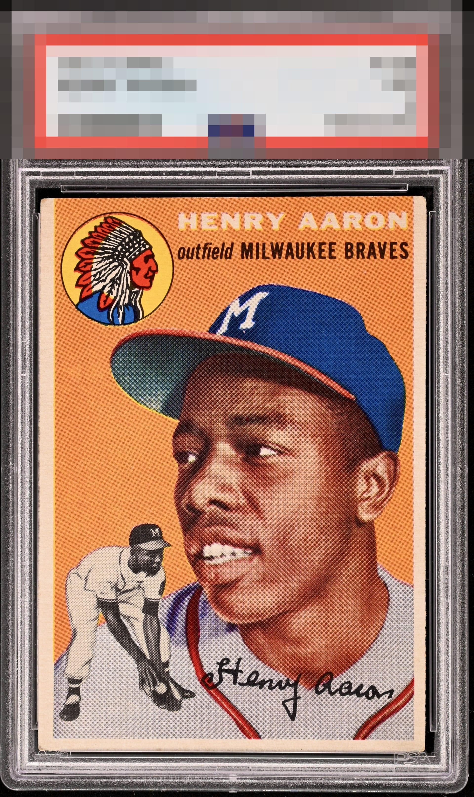
1954 Topps Henry Aaron #128
Reviews & Discussions
14 total reviews

This 54 Hank rook still sneaks into A tier for me - even though it’s OC. Everything else works together so well that to me it’s still a very high tier card.

Very high eye appeal here, even for someone like me for whom centering is so critical.

Very strong Hank. Everything that matters most is there with the obvious soft corners.

Great color, nice image, and the surface is clean. Slight centering shift and some minor corner wear are the only issues.

Quality example here. Centering is good, but not great and the corners are dinged. The color pops and the image is sharp.

Very good color and clean image. A touch off-centered keeps it from the top tiers.

The card has some great color and is vibrant. It is OC from left ot right and holds some soft corners.

The color really stands out on this Hank rookie. Obvious corner wear that is not overly distracting because the 4 corners are about the same as far a wear goes. Slightly off-center and bit of color chipping on the back but does not change the beauty of this card.

centering is off as the borders are mismatched. Bu the 1954 Topps is famous for off center and little or no borders. So this one is good. The card and image POP with the image coming off the page
EyeQ+
EYEQ+ TROPHY CASE


Rating Distribution
14 total reviews
Torn between B+ and A- here so it is strong eye appeal, no doubt. Going with the top tier because it really all comes together, that's the best way I can put it. The image holds my eye and I don't say to myself, "I want to improve that centering."