1954 Topps Henry Aaron #128
Reviews & Discussions
13 total reviews

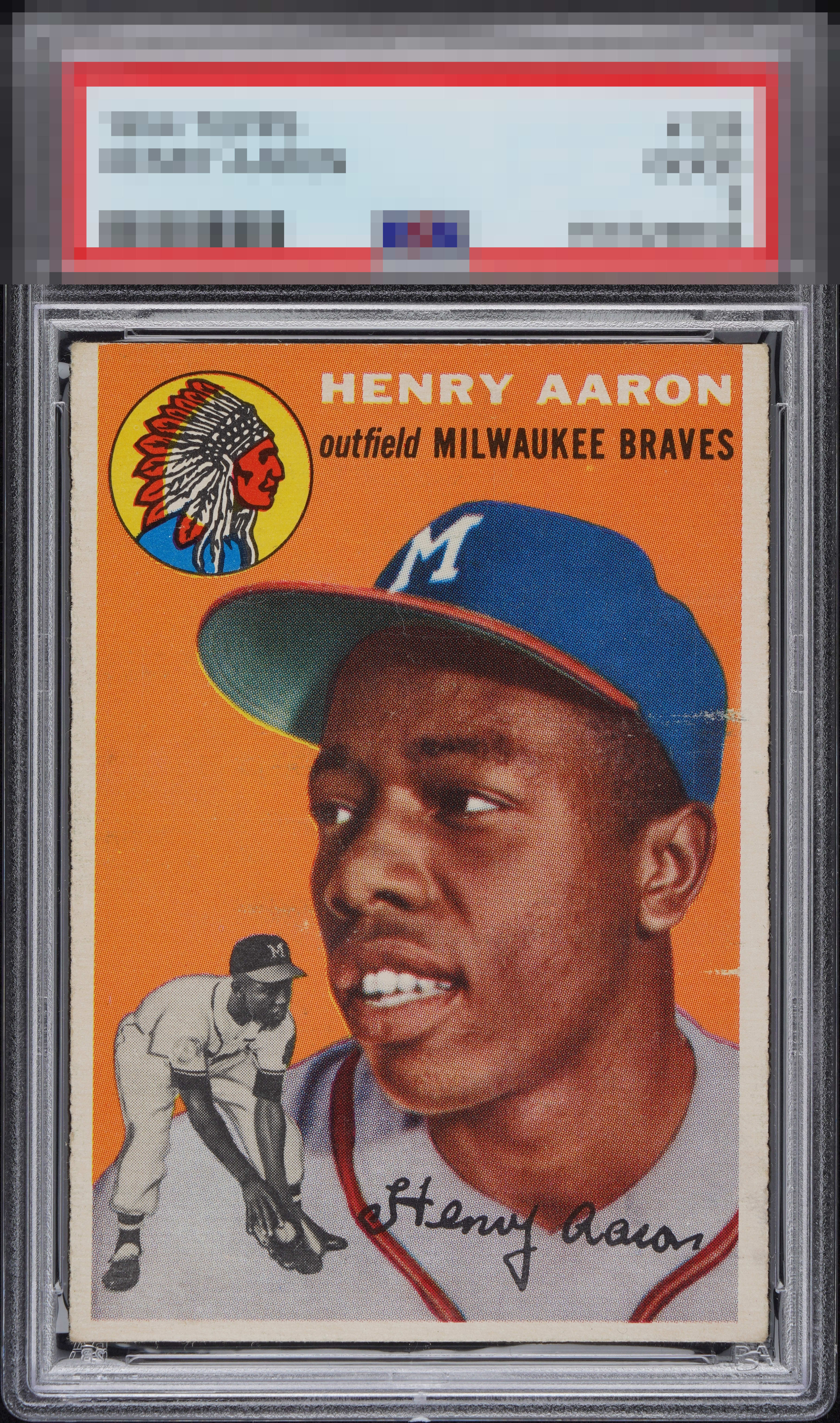
An overall very nice presentation, the surface damage on the right by his hat keeps this from A tier for me.

The horizontal marks would usually make me think B- or C+ as the max for eye appeal, but the side centering and rest of the image are really nice to my eye.

Not bad at all. Centering is good and the color is strong. The surface marks on/near Aaron's face are too prominent to ignore.

If you can get past the roller marks this is a good looking card

Decent centering on this Hank but the roller marks on the right bring it down just below an A tier.

Love the video add! This one just slips into my A Tier as I find those two horizontal marks distracting but not on the "record scratch, party's over" level. The centering grabs attention in a great way, and I think the direction Hank is facing actually is what helps mitigate the adverse impact of those lines.

Love the borders and size and centering and brightness. But multiple horizontal line on the right hold it back


Centering is a bit off but good enough. The white lines don’t bother me much.
EyeQ+
EYEQ+ TROPHY CASE

Rating Distribution
13 total reviews
The horizontal print lines or roller marks prevent the A Zone but the rest of this card shines brightly.