1954 Topps Henry Aaron #128

Reviews & Discussions
11 total reviews

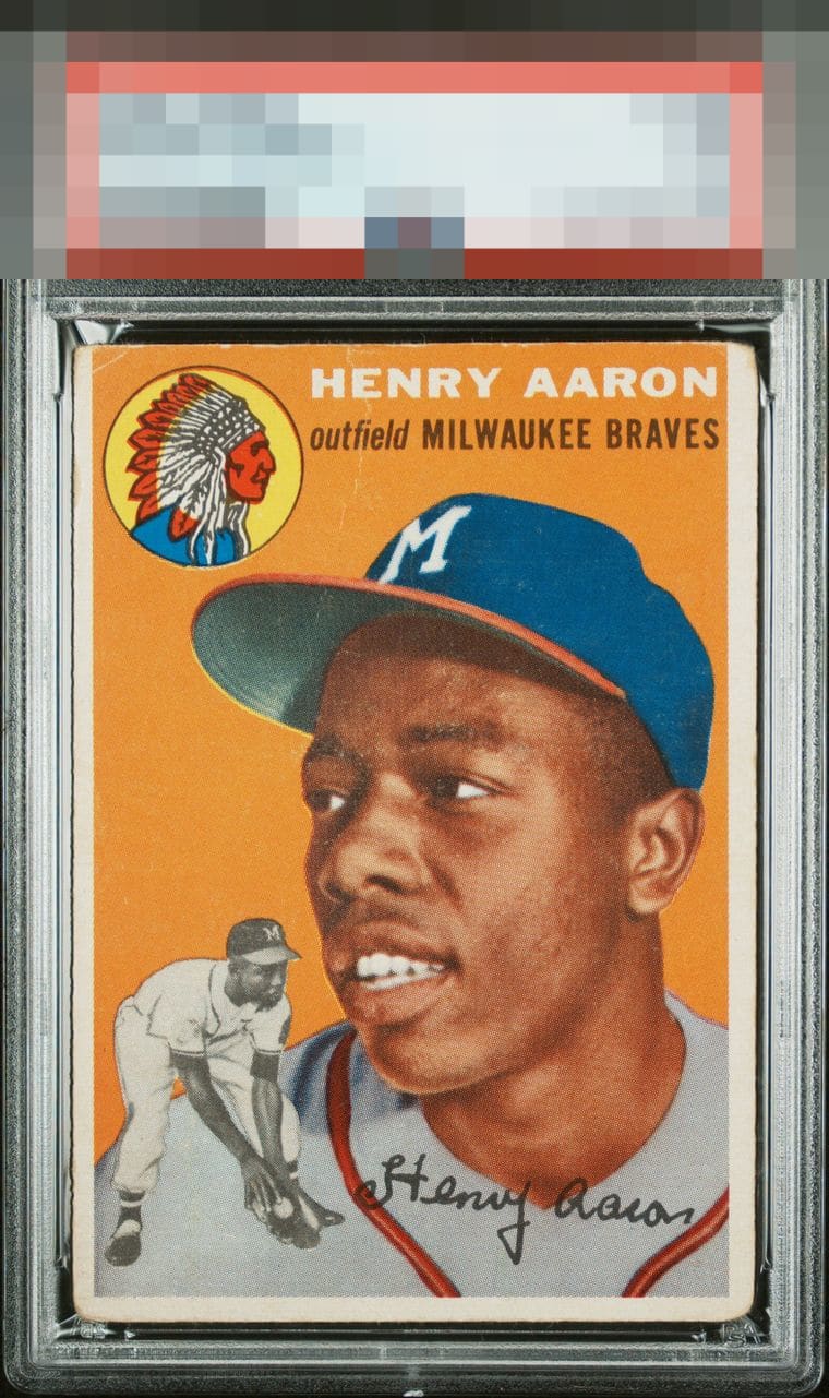
EyeBot detects respectable aesthetics despite flaws that reach consequential thresholds. The central image of Hank Aaron is without distraction, and the flaws such as centering and corner damage are banished to the outer reaches of the card.


I can enjoy this card and image and the flaws don't really get in the way, as compared to how a crease or fish eye right on Hank would bother me. This is that highly respectable B Tier where collectors can find great values. It's all about where the flaws are. With centter centering I would even put this in the A- tier.

This is the type of eye appeal I expect in a 'B,' as the central image is still very pleasing to look at, with no severe issues. Centering and corners are the flaws that impact.

The corners and centering catch my eye first. The image looks clean enough to hit the B tier.

love the size and brightness of the borders even with the wear on it. The colors are strong and the main image POPs a bit of speckling and off centering of borders holds it back but a solid example. Just an FYI to those that may not know finding this card with this good of centering of the borders and border size is tough


The central image is clean and problem free, with centering and corner wear impacting eye appeal. Solid looking example with no "loud" issues to my eye.
EyeQ+
EYEQ+ TROPHY CASE

Rating Distribution
11 total reviews
Rounded corners, centering and the crease along the upper center distract from the strong image and color.