1934 Goudey Hank Greenberg #62
1 / 2
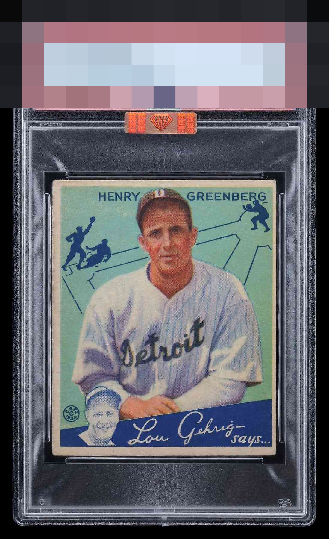
Click to enlarge
💬
Reviews & Discussions
8 total reviews

Colors are pretty good on this image. Centering is the big distraction for my eye. Corners wear is noticed as well. Lands in the 2nd tier.

Nearly impossible to find dead centered, this is actually pretty decent for the issue

Shift is quickly noted. Colors and corners are excellent. Beautiful card with delightful eye appeal.

nice card but uneven border sizes, off centering and extra toning hurt the overall appeal of the card. The colors and main image held up well


Good eye appeal with centering being the main aspect that detracts.
Locked
1 review
EyeQ+
124.0
Global Population
3
POPULATION ACROSS ALL GRADES AND GRADING COMPANIES
Global Eye Rank
#2
Population in Grade
2
POPULATION IN THIS GRADE ACROSS ALL GRADING COMPANIES
Eye Rank in Grade
#1
EYEQ+ TROPHY CASE

2nd Place
GLOBAL

1st Place
IN-GRADE
📊
Rating Distribution
8 total reviews
G
0%
A+
0%
A
0%
A-
1 rating
14%
1
B+
1 rating
14%
1
B
3 ratings
43%
3
B-
2 ratings
29%
2
C+
0%
C
0%
C-
0%
D+
0%
D
0%
D-
0%
F
0%
Good eye appeal and for this card especially. Centering will hold most of these back, and that's really the only flaw I note on this one.