1955 Topps Hank Aaron #47

Reviews & Discussions
10 total reviews

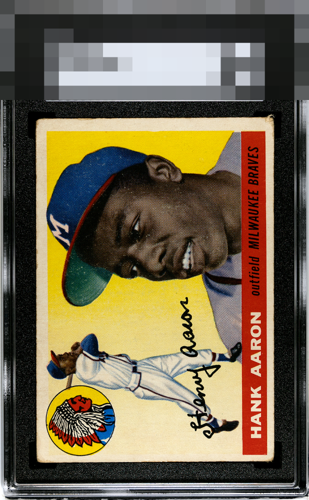
Some snow with soft corners hurts this grade. The bottom right corner really hurts this. It has beauty for its vibrant yellow.

Surface damage, centering, and the one rough corner. Color and registration are still good.


Presentable copy held back by centering, what looks like wear, and what appears to be a touch of snow around his face.

Strong colors for a vibrant yellow background can really pull the eye away from other issues. That is the case here as I am drawn to the colors and can excuse some centering and corner issues that would be more problematic on other cards.

Eye appeal remains enjoyable as the corner wear and centering don't get in the way of the images of Hank. Minor scattered PD on Hank's cap is a secondary concern.


The yellow and blue really Pops and the image is solid and the card is meant to be enjoyed. The border size and centering hold the card back and there is some noticeable surface wear

Very nice colors. Too much snow around the cap and face. Centering is off.

EyeQ+
EYEQ+ TROPHY CASE


Rating Distribution
10 total reviews
The red color where the name is pops right away for me. The centering side-side and top-bottom along with the top right corner become a distraction for me.