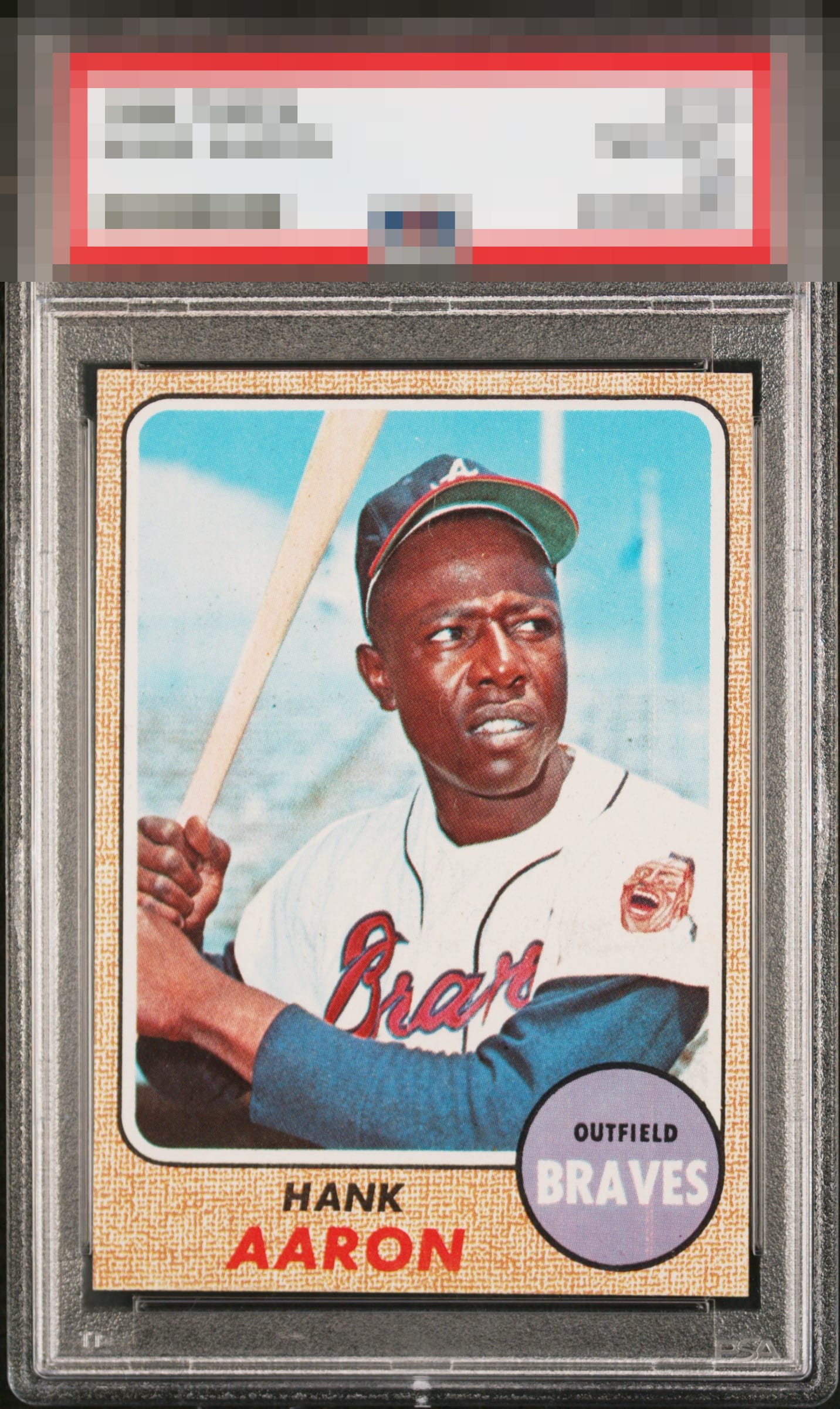
1968 Topps Hank Aaron #110
Reviews & Discussions
11 total reviews

Pleases my eye, with only one flaw in the team circle that draws attention.

Awesome 1968 Topps Aaron! Bold color, strong centering, and a clean surface that creates immediate visual impact. Particularly attractive nameplate presentation, with the red in "Aaron" displaying exceptional vibrancy and helping the design stand out. A soft team oval and a handful of small background specks, holding the example back from an even higher grade.


This is a very well-presented card with great corners. Some surface wear but very minimal.

A very nice example of a 68 Hammer. The purple circle is the only flaw that my eye picks up on. Centering works for me on this one.


Centering looks good to me. A few stray black dots in the background and a print defect below the "V" in Braves are the only issues.

centering is off and does not frame card well but the borders and edges are more solid than i would expect. Good image and colors
EyeQ+
EYEQ+ TROPHY CASE


Rating Distribution
11 total reviews
Pleases the eye with nothing that spoils the party.