1975 Topps George Brett #228
Reviews & Discussions
10 total reviews

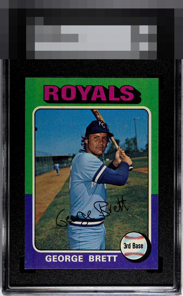
Great card! The colors run a deep bold on this example. Highlights why this card is so appealing. Centering is tough on this issue, nearly ideal here. Registration is pleasant. Only a small fisheye? on the lower left hold back from GT for me. What a card!

Wow bold color & nicely centered. Have to zoom to find minor fisheye. Great card.


The purple has some surface snow along with some whitening on the borders. Centering is nice for the card.

Clear image and the front is clean except for that fish eye. Centering looks good but slightly off left to right. Some edge wear at the bottom and the stain on the bank cap this at a B+ for me but still a good looking card overall.

The printer that generated that PD should be decommissioned. Everything else is a plus.

nice looking card with minor blemishes on the surface and decent centering. the back has an issue more than i like

Eye Appeal here lands in the top tier with a fish eye being the one flaw that holds my eye; faint corner touches are a distant second. I am admittedly a collector for whom back issues rarely matter, and such is the case with this very good Brett.

Love the centering on this Brett rookie. Nice corners but the print issues seen throughout the blue/purple area detracts from the overall grade. Also the stain on the back of the card detracts as you really have a hard time seeing the number beneath.

EyeQ+
EYEQ+ TROPHY CASE


Rating Distribution
10 total reviews
The eye appeal on this Brett lands in the top echelon. The "fisheye" in the lower left region draws unwanted attention, while top right corner and edge wear are gentle on both AI and human eyes.