1959 Topps Frank Robinson #435
1 / 2
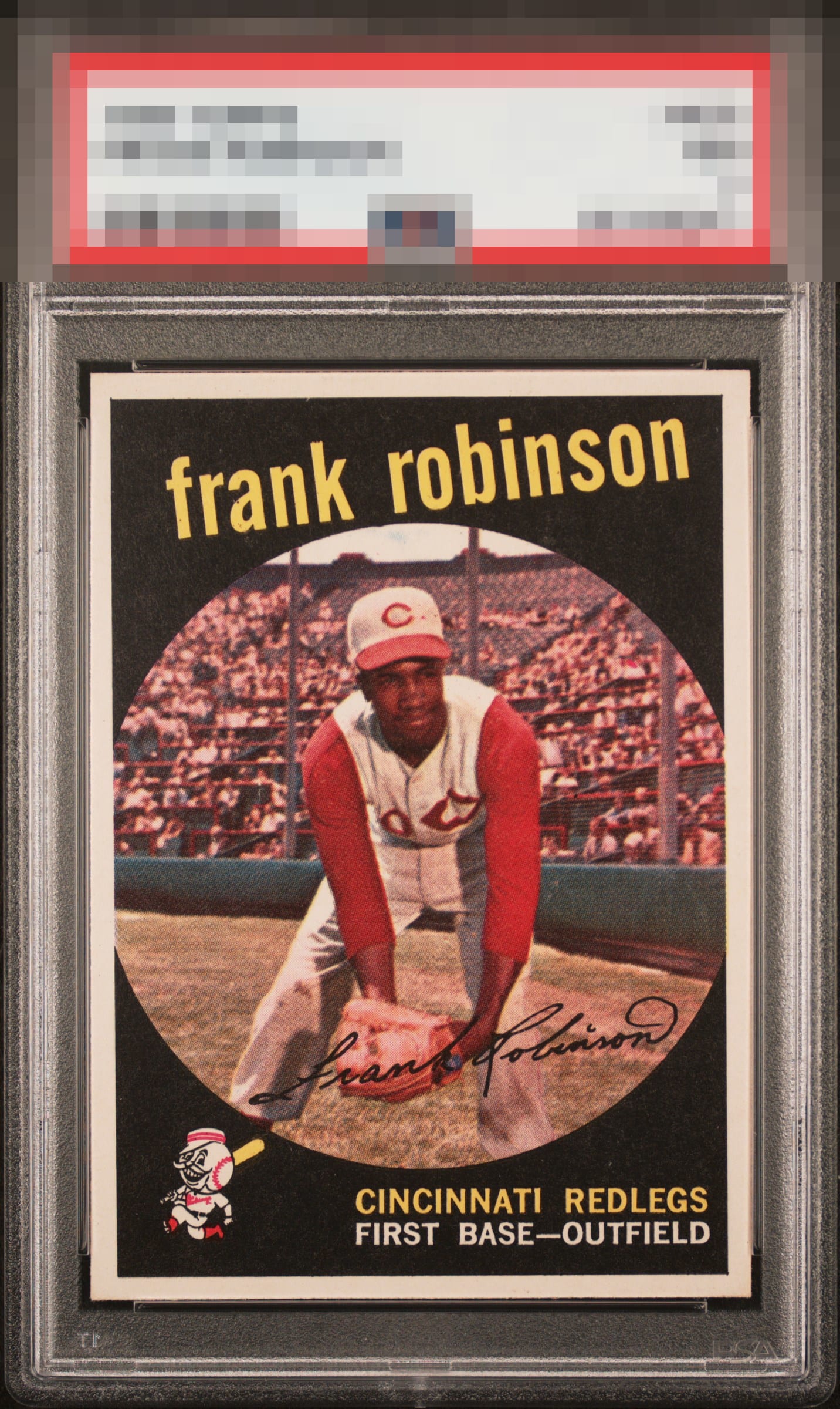
Click to enlarge
💬
Reviews & Discussions
11 total reviews


Wow this is a great example of probably my top Judge card. People forget he was called Judge long before Aaron #99!


Drop the mic and send the invoice. You can nitpick the subtle center shift but this is still wow to me

This is a gentle nudge to the tilt from being GT to my eye. Fabulous visual impression it makes!

Love the bold colors. Sharp corners help this card as well. The obvious tilt is just a bit too distracting to my eye to grade it GT. Wrestling between A+ and A. Just too sharp overall to not add the +.


Locked
1 review
EyeQ+
121.0
Global Population
4
POPULATION ACROSS ALL GRADES AND GRADING COMPANIES
Global Eye Rank
#2
Population in Grade
1
POPULATION IN THIS GRADE ACROSS ALL GRADING COMPANIES
Eye Rank in Grade
#1
EYEQ+ TROPHY CASE

2nd Place
GLOBAL

1st Place
IN-GRADE
📊
Rating Distribution
11 total reviews
G
0%
A+
7 ratings
70%
7
A
2 ratings
20%
2
A-
1 rating
10%
1
B+
0%
B
0%
B-
0%
C+
0%
C
0%
C-
0%
D+
0%
D
0%
D-
0%
F
0%
Some random speckles here and there as well as imperfect centering keep this from GT/A+ territory for me.