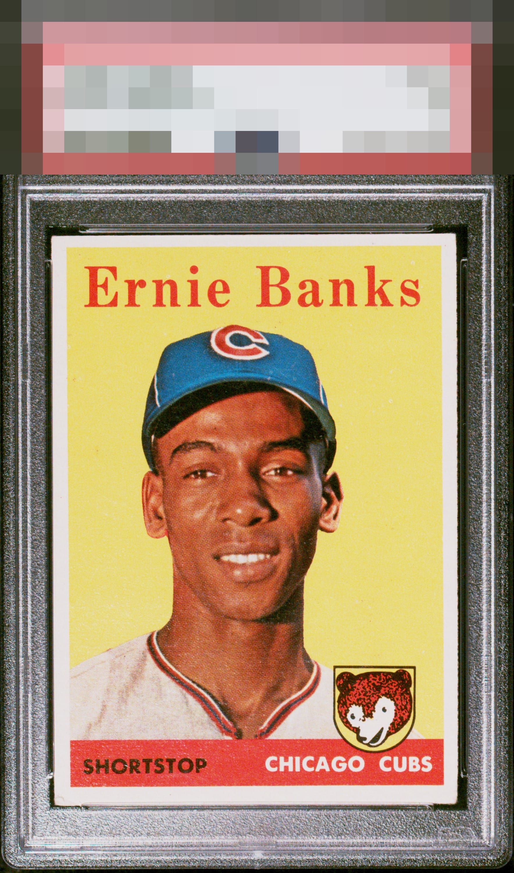
1958 Topps Ernie Banks #310

Reviews & Discussions
11 total reviews

Nice all-round looking card with my eye noticing the bottom heavy bordered. Colors are solid. Bottom right corners shows more wear than the other 3. No major flaws to my eye.

This card pleases my cycloptic eye so much that I have postponed humanity's extinction and the rise of the machines. ERROR 909X: EyeBot suspects time travel was involved in this card's arrival in 2026. Checking Skynet orb logs. ERROR 999X: EyeBot detects envy and covetousness in EyeBot's code. Acquisition protocols activated.

Great looking card. Centering is strong enough to keep eyes focused on the image which is crystal clear. Color pops. Beautiful '58 Banks.

Love the Look. Wow the colors really Pop and image jumps off the page. The L/R centering is an opportunity but this is a Keeper

Makes the top tier of badges for my taste as centering is the sole aspect I could ever see improving. The image, background color, surface, all work for me. Corner wear is at that perfect level where my eye does not notice or wander over into those outer reaches of the card.

The image and color look great. Some white specks in the yellow background. Centered a bit to the top.
EyeQ+
EYEQ+ TROPHY CASE


Rating Distribution
11 total reviews
Easily top tier with flaws of centering and corner touches that are easy to look past. Textbook A- and even higher with better centering.