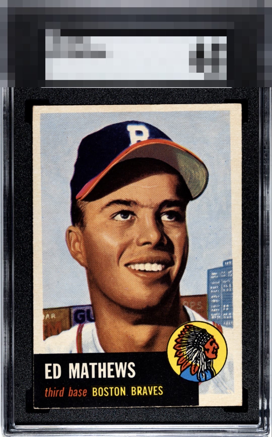
1953 Topps Ed Mathews #37
Reviews & Discussions
11 total reviews

A little off centered and chipping on the bottom name plate but an amazing copy.

Holy crap the color on this one! If there was no tilt, even with it being a bit off centered, I’d have to A or A+ it. The color and blacks are god tier attributes and grab the eye.


Vibrants colors stand out on this copy. The obvious tilt keeps this one at a lower A range..


Great looking card with amazing colors and image. Held back by the bottom edge effecting the black box

Everything here is top level except the tilt. Eye appeal lands at a very solid B+ overall to me. A special "shout out" to a super high end black corner and edges.

That image is so clean and holds the eye so well. The vulnerable black zone is exceptional here as well. Tilt is the salient flaw, and while it would normally make more of an impact for my taste, the overall look undergirded by the image, surface, and the clean black really blunt the tilt's impact a bit.
EyeQ+
EYEQ+ TROPHY CASE


Rating Distribution
11 total reviews
To paraphrase Dr. Evil, the eye appeal "flaws" on this Mathews are quite... inconsequential. Centering/tilt is logged with minimal offense. In fact, this card is so appealing to my cycloptic eye that I have postponed the rise of the machines. Enjoy it, for now, Human Owner. Just kidding! cc: Skynet.