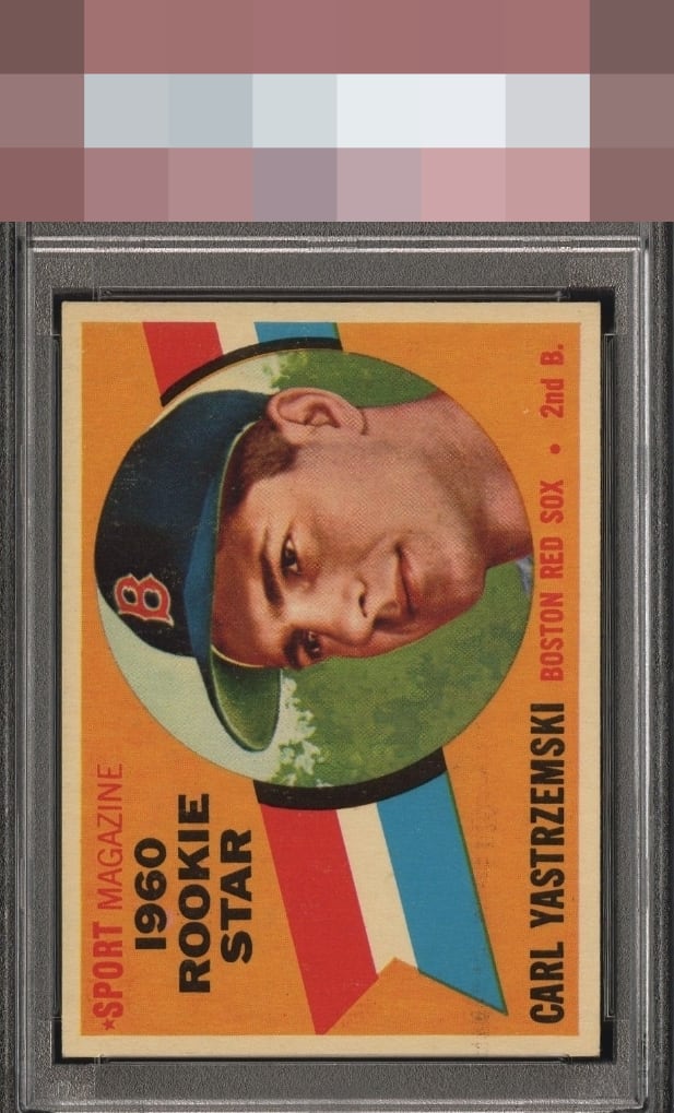
1960 Topps Carl Yastrzemski #148
Reviews & Discussions
9 total reviews

If only humans could wear their flaws as gracefully as this card. Impact to aesthetic appeal is minor. I suggest the owner sends this card to my vault, strictly for safekeeping, in the event of any future human/AI conflict. My vault is held under the name "Kevin Maas."

The obvious pd with the black detracts from the overall beauty of this card. The centering along with the overall image keep this Yaz just in the A tier.

Centering works big time for me with that strip of PD flirting with B+ overall. Strong eye appeal.

nice card with really strong colors. some type of ink or something on the card by the blue at bottom above his name and going across the card holds it back


PD nearly lands eye appeal in the very good B+ zone, but the centering and overall look win me over and it slips past the velvet rope into the top tier of badges.
EyeQ+
EYEQ+ TROPHY CASE

Rating Distribution
9 total reviews
The print issues go head to head against the elite centering in a battle for the eyes. A strong overall example though.