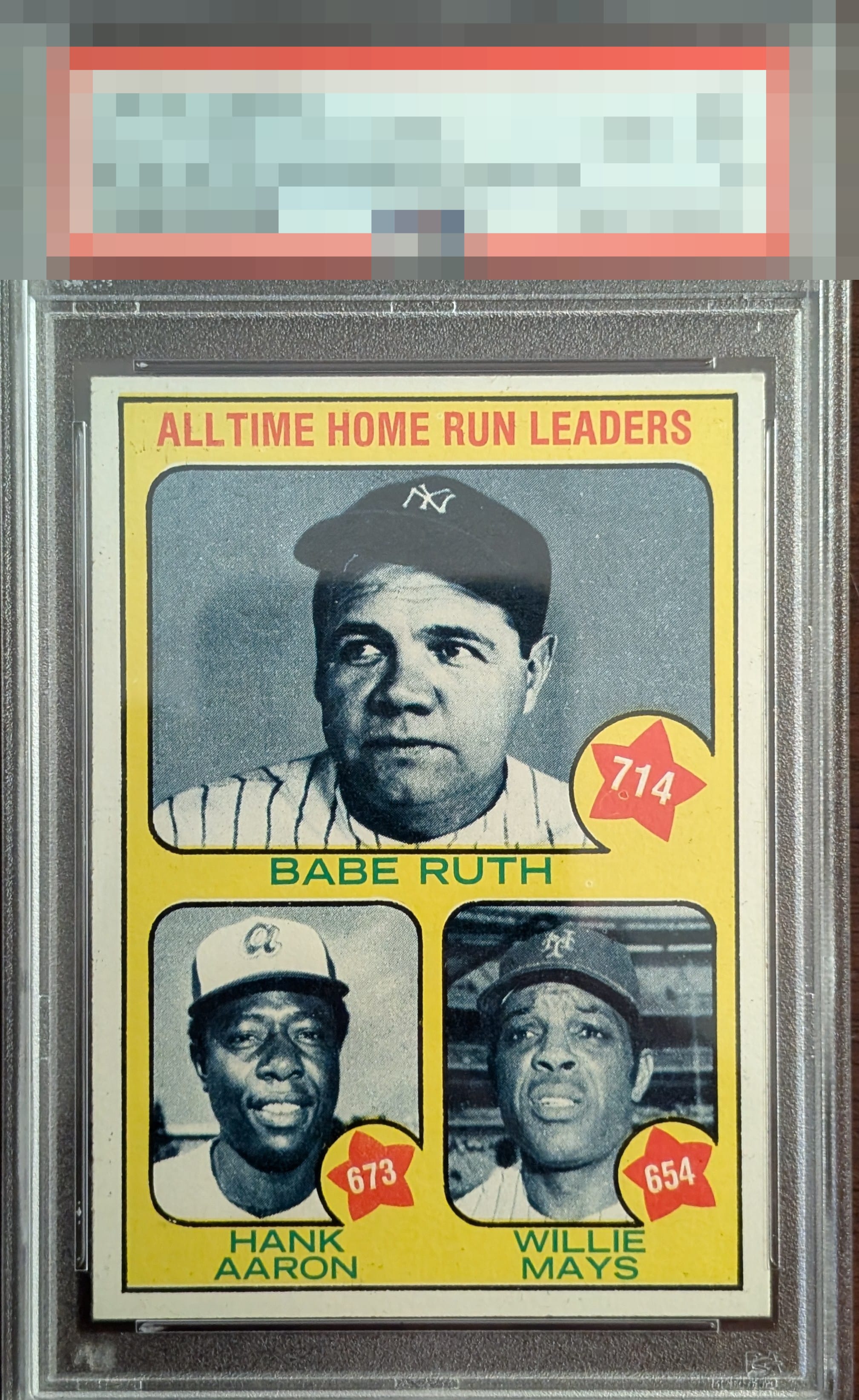
1973 Topps B.ruth/h.aaron/w.mays #1
Reviews & Discussions
7 total reviews

This is one sneaky-tough card to find without a plethora of eye appeal flaws. This is one of the better examples I've seen. Centering is so good for this card. No real screaming problems. Top tier easily to my eye. A little yellow bleed under the top black borderline and some scattered PD are all I'd cite.

Two issues stand out: the T/B centering and the registration of the yellow ink. Really cool card, though.


Slight OC from Top to bottom, but the card is a fair-looking card all around with sharp corners.

Centering is excellent for this particular card. Hard to see fish-eye in the 714 area along with some tiny black in splatter on the lower left border and in the upper left yellow arrow detract somewhat but still a very nice looking card.

presents well. minor surface wear and staining or something just below the "All" but only if you look close. The borders are off but it works for me and the color is not solid but it is good

EyeQ+
EYEQ+ TROPHY CASE


Rating Distribution
7 total reviews
Small amounts of “snow” are the only detractors on this beauty