1957 Topps Bob Clemente #76
1 / 2
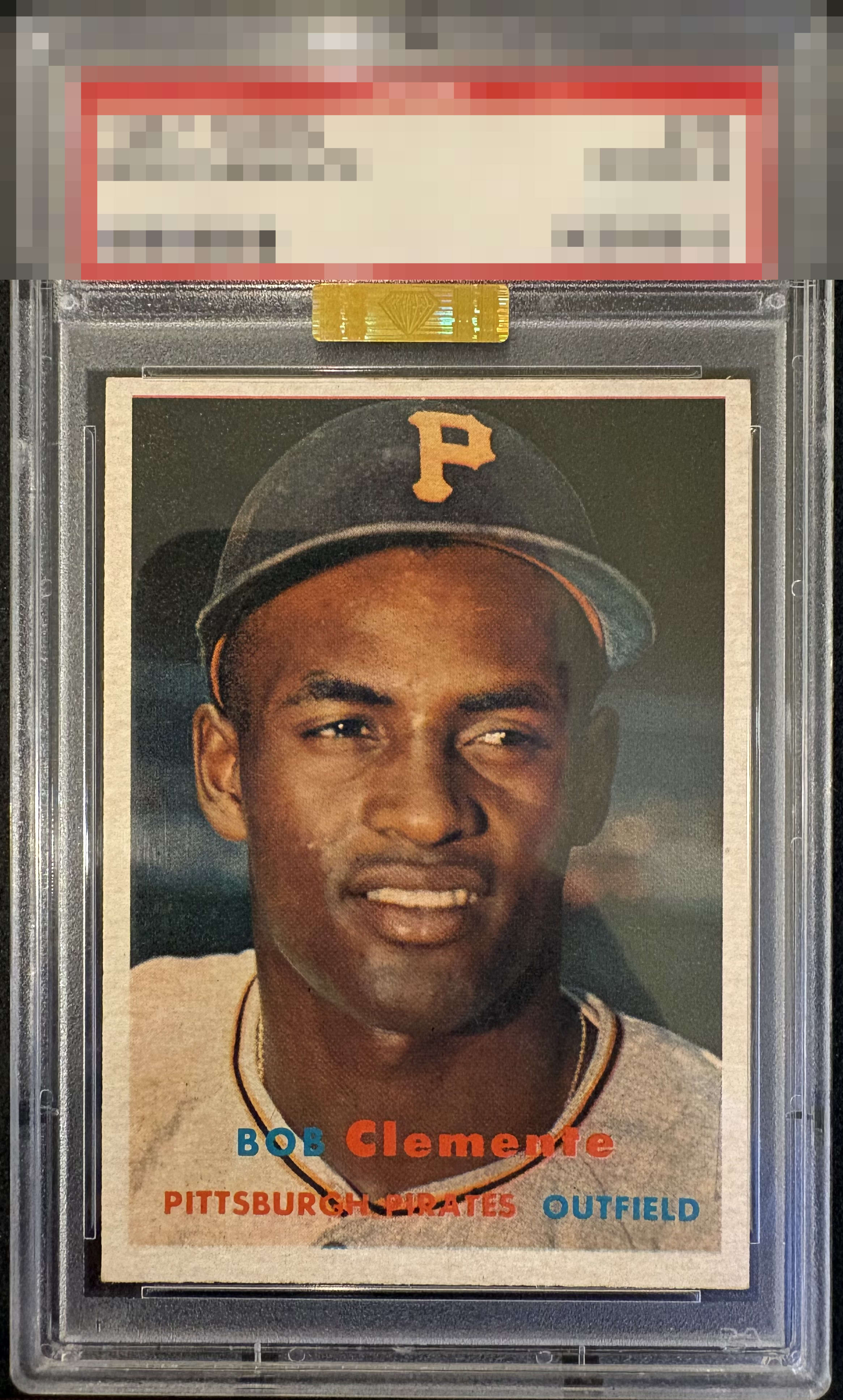
Click to enlarge

💬
Reviews & Discussions
7 total reviews


Normally, for my taste, this centering would cap eye appeal at a very respectable B+, but there's something about this card...maybe it is the clarity of the image...it has mojo.

Great image, especially 57s can often have blur or PD that gets in the way of enjoying the photo. Centering is the only flaw worth noting to me.

Nice looking card but the centering is lacking just enough with the bottom heavy border to keep this card from grading higher.


love the look and the clarity of the image. Nice size borders with good centering
Locked

0 reviews
EyeQ+
155.0

Global Population
2
POPULATION ACROSS ALL GRADES AND GRADING COMPANIES
Global Eye Rank
#1
Population in Grade
1
POPULATION IN THIS GRADE ACROSS ALL GRADING COMPANIES
Eye Rank in Grade
#1
EYEQ+ TROPHY CASE

1st Place
GLOBAL

1st Place
IN-GRADE
📊
Rating Distribution
7 total reviews
G
0%
A+
0%
A
2 ratings
29%
2
A-
2 ratings
29%
2
B+
2 ratings
29%
2
B
0%
B-
1 rating
14%
1
C+
0%
C
0%
C-
0%
D+
0%
D
0%
D-
0%
F
0%
The top/bottom centering shift takes a big hit for my eye. And the red registration shift at the top catches me as well. Left/right is good though. Don't let the gold sticker fool you. That does not imply eye appeal. It only means the technical grade is under graded.