1952 Topps Willie Mays #261

Reviews & Discussions
11 total reviews

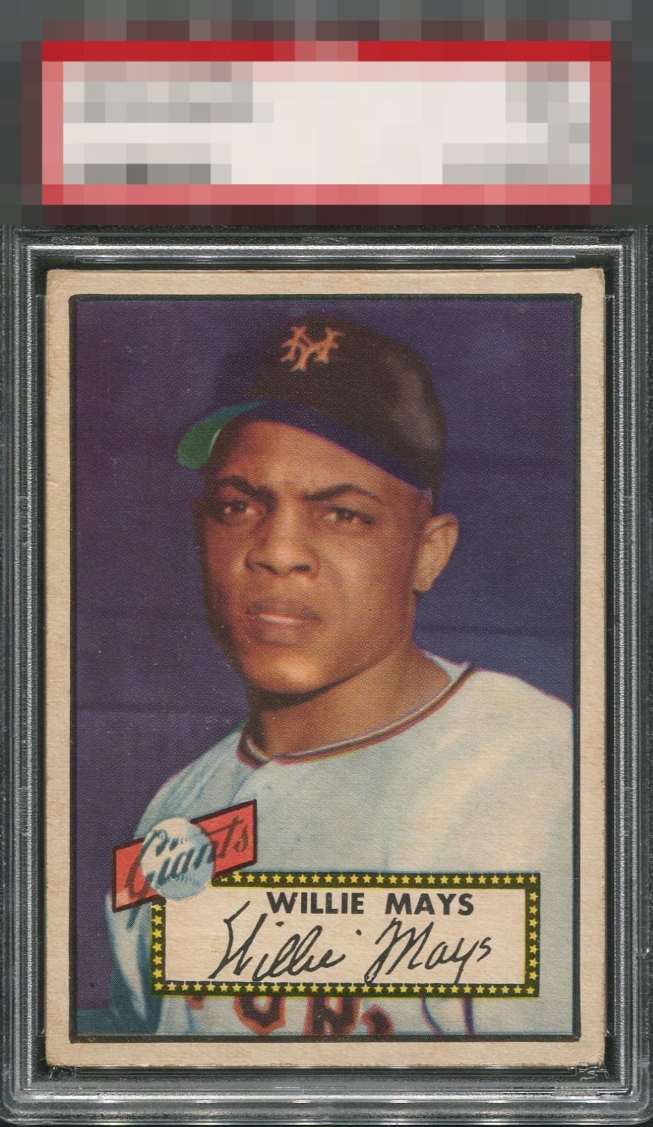
Wow, the centering is maybe the best I've seen on the '52 Topps Mays! It is framed so well, which alone nearly carries it into the top tier. Surface looks quite clean. Only some image softness and not the boldest of colors hold this back from a higher score. This is an example to be extremely proud of!


Centering and colors are top notch. A bit of registration and corner wear are the only flaws that bring this to a strong A.

Obvious edge wear & mild toning but this one is nearly dead centered which you just don't see on this card often.

Centering is great and the color is rich, but the registration is a bit off.

The edges will do it for me to bring this grade down. The centering is great with the image that still pops.

Card art is fantastic and the background color makes it stick out, just the edges are a little dirty.

Big bold border that are so well centered it frames the card so well. Would love to rate higher but a bit to much speckling on the card for me.

Holy Cow this centering is bananas. If it was a hair off I would go A- but the centering is just too outrageous and there are no "loud" flaws that bother my eye.
EyeQ+
EYEQ+ TROPHY CASE


Rating Distribution
11 total reviews
The centering along carries this 52t to an easy-A for me. You just don’t see centering like this often.