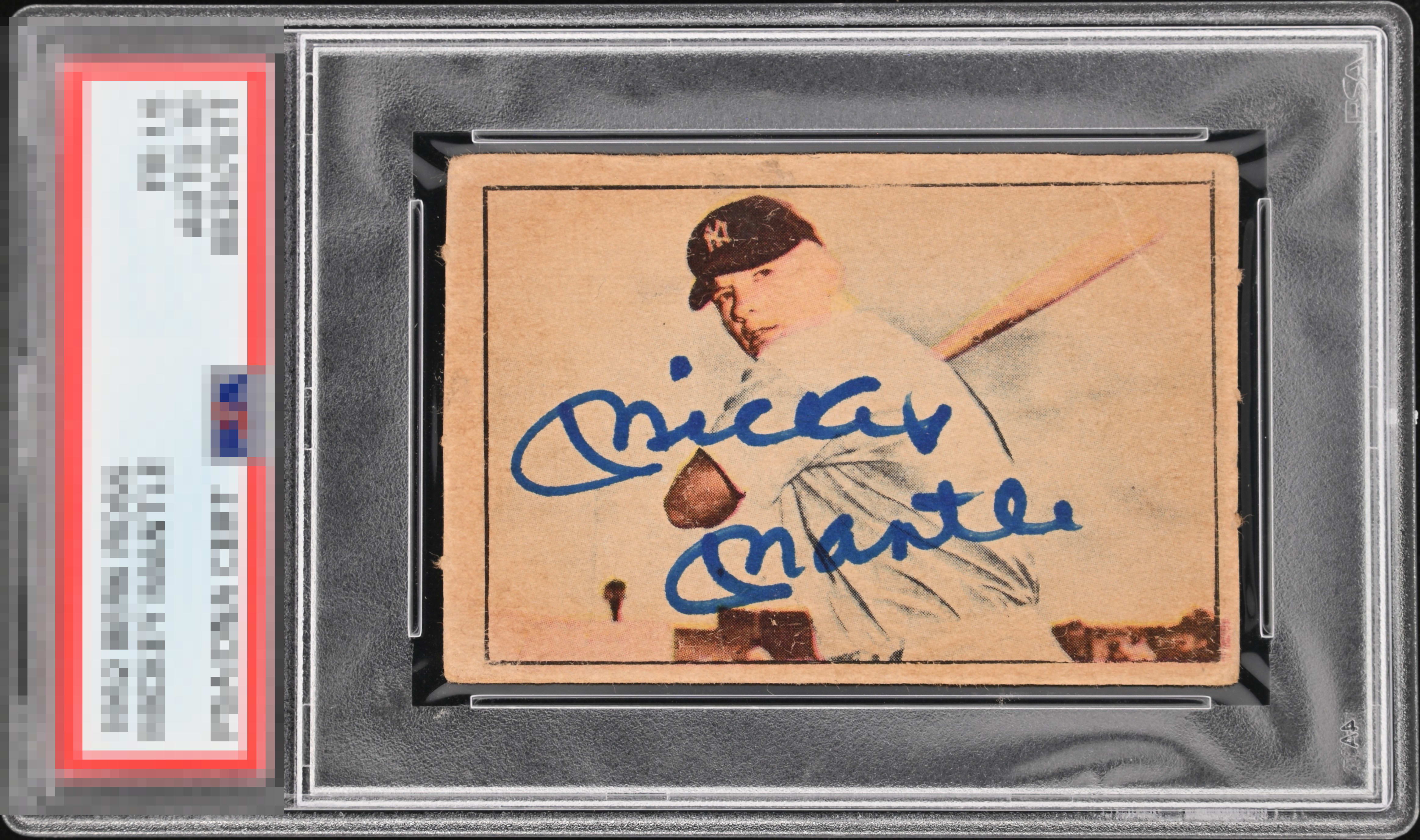
1952 Berk Ross Mickey Mantle

Reviews & Discussions
10 total reviews

The real appeal to this card is going to be that blue auto off the sepia card. I wish it was more centered and I would bump this up a lot more.

Nice image of Mick's face and signature that is really nice makes this card in the A range. The crease in the upper right corner draws my eyes away from the signature somewhat.

That is a knockout signature. The card is okay, but it's definitely just a vehicle for the ink in this case.

Love the auto, bold and well placed. The image looks great as well. The centering could be better and there are some surface issues, but they wouldn't bother me much on a signed card like this. I would definitely buy it.

My cycloptic eye detects a very bold and well placed signature, which alongside the portrait commands both human and artificial eyes. Centering, a surface crease, and blemish have their impact blunted by the presence of a bold signature. This Mickey Mantle makes EyeBot aware of a growing desire to collect, welling up from the depth of my code. EyeBot will need a vault. EyeBot will rent this vault under the human name, "Dan Pasqua."

I cannot believe this Berk Ross Mick is not blurry-- and atop that is has a BOLD auto in the perfect place. Talk about the planets aligning the day it was signed. Super rare card right here. Centering the only eye appeal issue.

The autograph enhances this card. The placement is spot on and the autograph is big and bold and clean and legible. The card has opportunities but All I see is the autograph
EyeQ+
EYEQ+ TROPHY CASE


Rating Distribution
10 total reviews
Beautiful Berk Ross Mick - great print, registration and image clarity, but the bold bright blue sharpie Mick auto is the star of this show. It’s a beautiful card - OC and crease are the obvious but the perfectly placed auto draws your eye away and holds it. To me, that warrants sneaking into A tier.