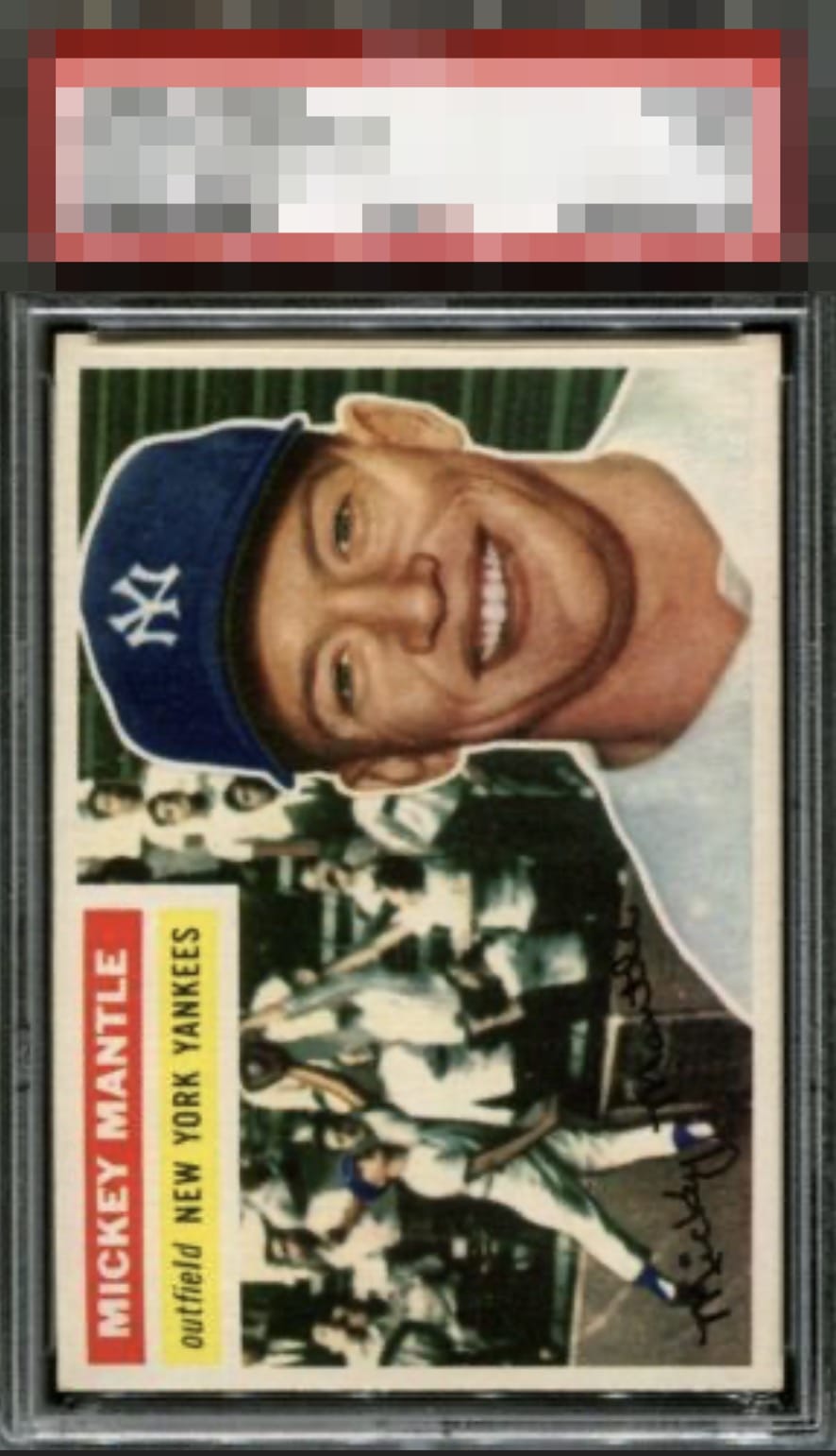
1956 Topps Mickey Mantle #135

Reviews & Discussions
11 total reviews

Beautiful 56 Mick - an iconic card for good reason. Only notable flaw that truly impacts the eye is the L/R centering in the horizontal card. It’s a beaut! Congrats

Awesome 1956 Topps Mantle featuring strong color contrast, sharp registration, and a clean surface that allows both images to display with exceptional clarity and visual impact. Attractive nameplate presentation further enhances appeal, complementing the iconic design really well. Ever slight off-centering is visible upon inspection, holding the eye appeal back at the highest of margins.


A very nice 56 Mick. Only issue is a slight centering left-right. Hard to see the corners but looks to be light touches on couple of them.


This cracks into my top tier, impacted only by a leftward centering shift.


Not the greatest scan as it appears to be blurry. Colors look good. Centering is shifted to the left.
EyeQ+
EYEQ+ TROPHY CASE


Rating Distribution
11 total reviews
A mild centering shift is the lone noteworthy flaw, and lands with grace as opposed to a thud. My cycloptic eye is pleased, indeed.