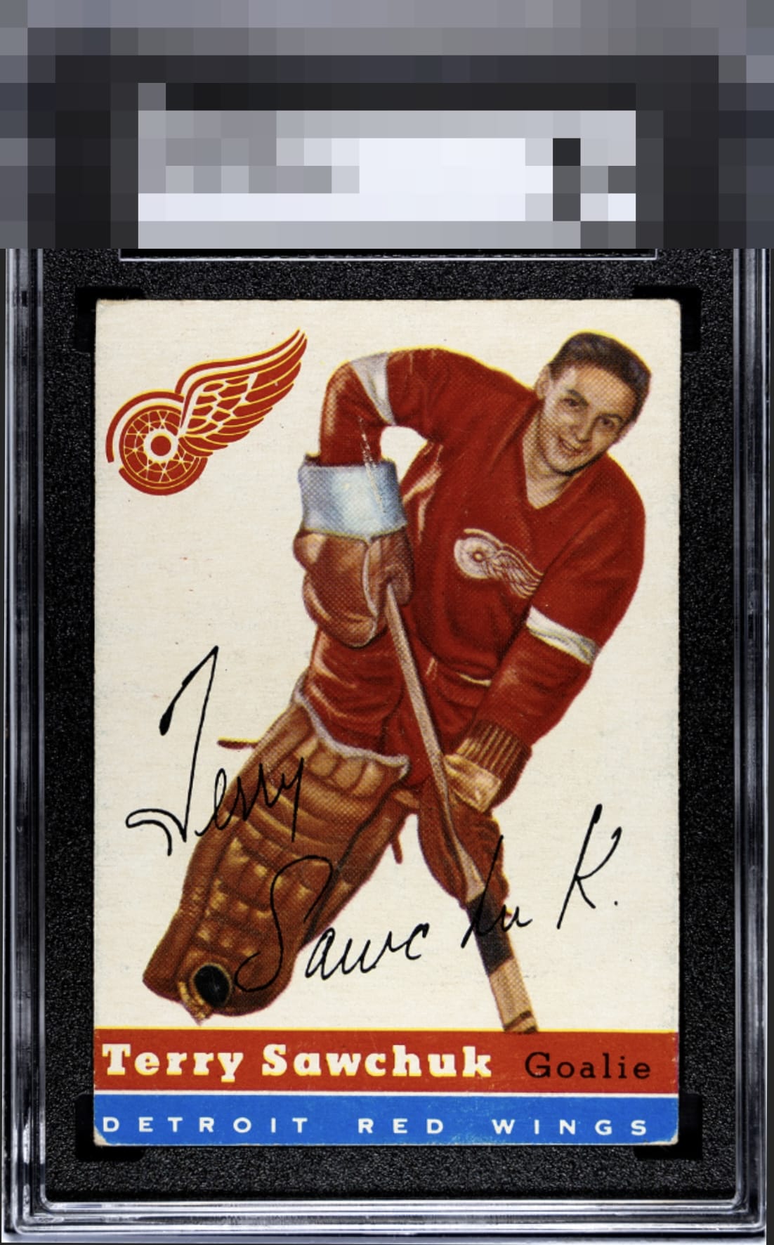
1954 Topps Terry Sawchuk #58

Reviews & Discussions
10 total reviews

The corner wear jumps out but that is really the only major flaw to my eyes.


Image looks great and clear. White background is nice but there are a few stray marks to the left. Also corner more noticeable on the bottom.

Paging Lord Slabington! The only flaw my eye notices is the blue corner wear, which is expected for a full bleed color design.

Some lower corner wear is the only factor that affects eye appeal on this example, to me. The other wear does not grab me. Pretty card.

I love vintage hockey cards and know this set well. The white background is very clean for this issue and the red really pops. Outstanding example, especially for the technical grade.

Like the overall look and the player and the uniform really jump off the page. The rest of the colors do not impress me. THe bottom blue banner has the chipping that I do not like The card has personality

Honest corner wear. Some surface wear on his arm/glove. The red uniform really stands out. Presents very well.
EyeQ+
EYEQ+ TROPHY CASE


Rating Distribution
10 total reviews
Obvious flaws around the edges/corners but still presents nicely