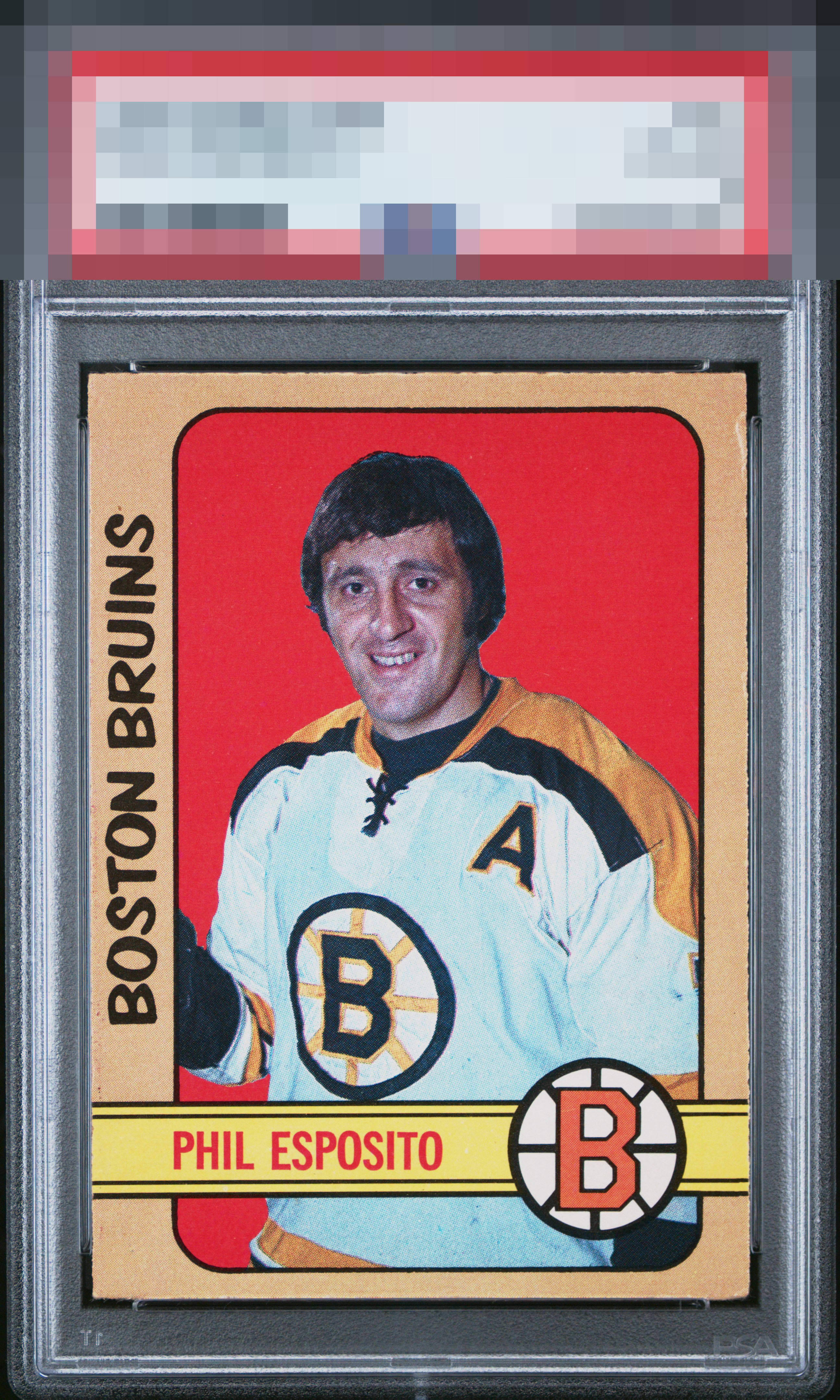
1972 O-pee-chee Phil Esposito #111
1 / 2
Click to enlarge

💬
Reviews & Discussions
4 total reviews

Card looks good with solid image and colors and they contrast well. Centering might or might not be off but the way card is layed out cannot tell


Very good eye appeal that merits a badge at the higher end of the spectrum. The clean red background and yellow print make for such an attractive specimen. The edge wear and lower right corner wear land subtly for the eye, which is always the ideal.

4 of 7 reviews

0 reviews
EyeQ+
--
Global Population
1
POPULATION ACROSS ALL GRADES AND GRADING COMPANIES
Global Eye Rank
—
No Eye Q+ score
Population in Grade
1
POPULATION IN THIS GRADE ACROSS ALL GRADING COMPANIES
Eye Rank in Grade
—
No Eye Q+ score
EYEQ+ TROPHY CASE

GLOBAL

IN-GRADE
Trophies appear here when earned.
📊
Rating Distribution
4 total reviews
G
0%
A+
0%
A
0%
A-
1 rating
25%
1
B+
3 ratings
75%
3
B
0%
B-
0%
C+
0%
C
0%
C-
0%
D+
0%
D
0%
D-
0%
F
0%
Great color and the image looks clear. I can't really judge the centering as this may be how they're supposed to look. A couple issues around the edges keep this just below A tier.