1954 Topps Gordie Howe #8
1 / 2
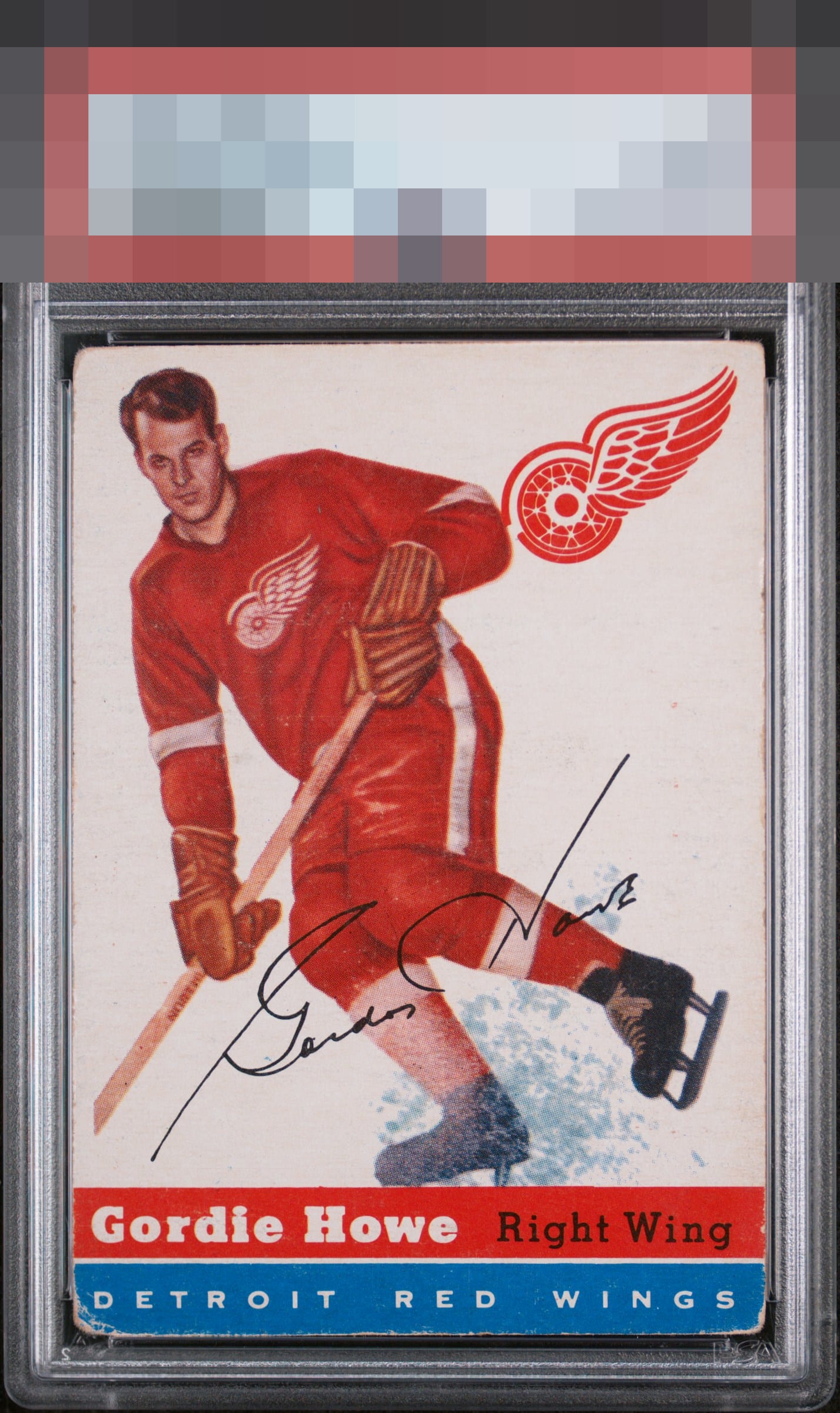
Click to enlarge
💬
Reviews & Discussions
4 total reviews

to much wear around the edges and borders and to much nicking on the bottom colors but the main image holds solid with good colors

Good aesthetics. This is the kind of wear that really doesn't bug me much. A fish eye on the player or focus blur make much more impact to me.

3 of 7 reviews
1 review
EyeQ+
--
Global Population
3
POPULATION ACROSS ALL GRADES AND GRADING COMPANIES
Global Eye Rank
—
No Eye Q+ score
Population in Grade
1
POPULATION IN THIS GRADE AND GRADING COMPANY
Eye Rank in Grade
—
No Eye Q+ score
EYEQ+ TROPHY CASE

GLOBAL

IN-GRADE
Trophies appear here when earned.
📊
Rating Distribution
4 total reviews
G
0%
A+
0%
A
0%
A-
0%
B+
0%
B
2 ratings
67%
2
B-
0%
C+
1 rating
33%
1
C
0%
C-
0%
D+
0%
D
0%
D-
0%
F
0%
A very colorful card and good image. A bit too much corner for my liking.