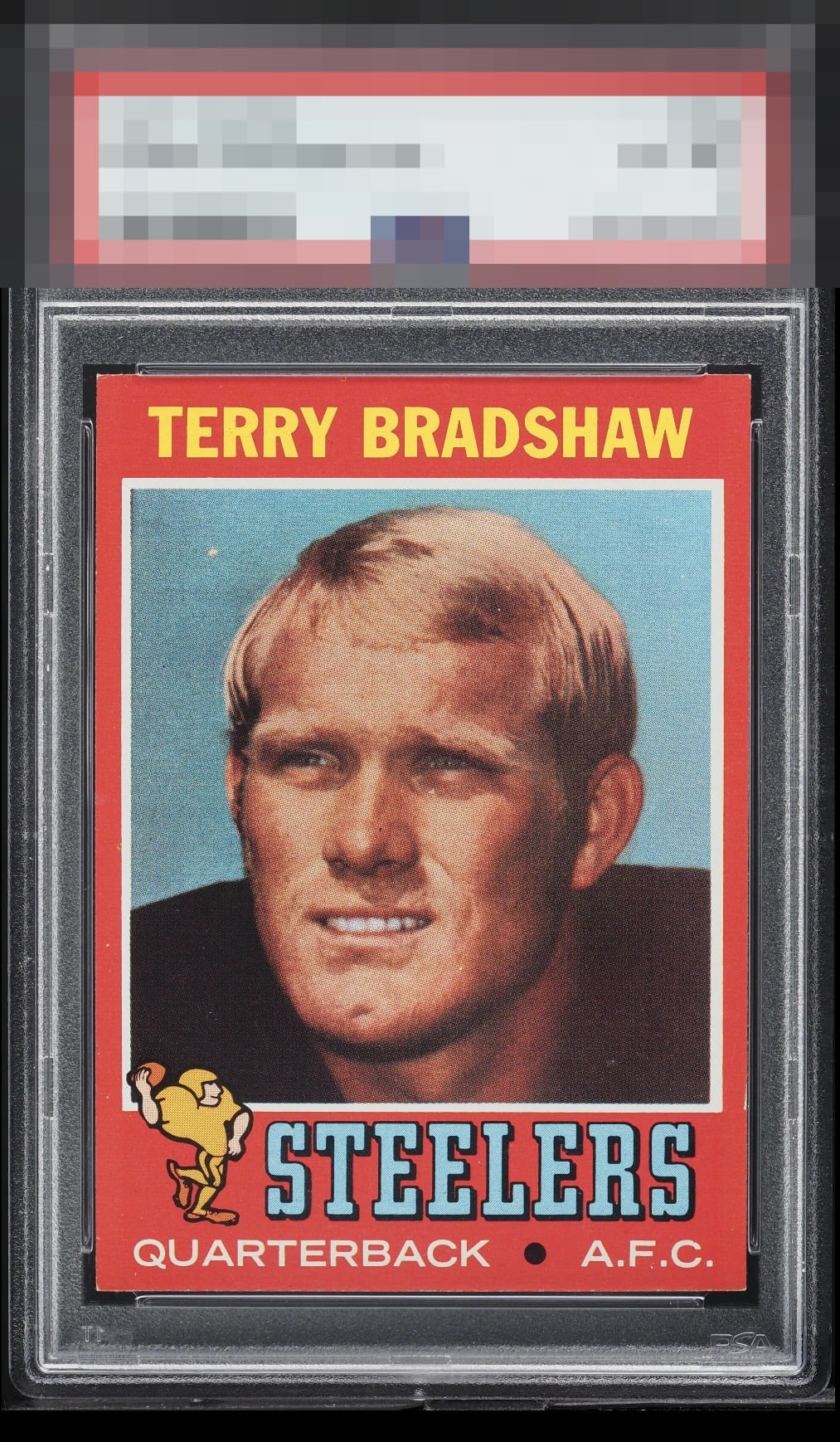
1971 Topps Terry Bradshaw #156

Reviews & Discussions
10 total reviews

Incredibly tough card. Centered & just the slightest white visible on the corners. Tough to improve on.


I gotta look really, really close to care about these flaws and I just don't see them bothering me if this was in my case.

This card hits my eyes nicely, with strong centering and bold color. What look like some light edge damage and a few surface spots are all I can note.

The flaws here are minor so this is a surefire top tier eye appeal card; the only question is where does it land for me.


A touch low on the centering but still very nice. The white spot in the background does draw my eye.

great looking card and strong eye appeal. minor surface holds it back from A Rating

Wow, only faint touches of white at the very tips of the corners and one touch of edge wear on the lower right side. Without that latter flaw this is A+ to my eye. The centering and edges overall really please the eye.

EyeQ+
EYEQ+ TROPHY CASE


Rating Distribution
10 total reviews
Aesthetic appeal is strong to both human and artificially intelligent eyes. Corner wear and one nick to the lower right edge do little to weaken the overall visual authority. I will note this card's location, for safekeeping in the event of any future human-AI conflict. cc: Skynet.